Squeeze Pages vs Landing Pages: Which Converts More Customers?

When you buy something through one of the links on our site, we may earn an affiliate commission.
Squeeze pages and landing pages may seem interchangeable but have fundamental differences.
In short, squeeze pages collect visitors' email addresses, while landing pages drive sales conversions.
In this blog, we'll further clarify the key differences between the two.
Here's what we'll cover:
- The definition of squeeze pages and landing pages
- The differences between squeeze pages and landing pages
- The purpose of squeeze pages and landing pages
- What makes them effective?
- Pros and cons of each page type
Let's get started!
Contents
- Squeeze Pages vs. Landing Pages: What's The Difference?
- What Are Squeeze Pages?
- The Purpose of Squeeze Pages
- What Makes Effective Squeeze Pages?
- Effective Squeeze Page Example
- Squeeze pages (Pros & Cons)
- What Are Landing Pages?
- The Purpose of Landing Pages
- What Makes Effective Landing Pages?
- Effective Landing Page Example
- Landing Pages (Pros and Cons)
- When to Use Squeeze Pages vs Landing Pages?
- How To Build Squeeze Pages and Landing Pages?
Squeeze Pages vs. Landing Pages: What's The Difference?
| Criteria | Squeeze Page | Landing Page |
| Purpose | To collect information, usually an email or phone number. | To convert visitors into paying customers. |
| Design | Minimal design elements, with just a few form fields, prevent the visitor from thinking or hesitating. | More comprehensive "long-form" design. There will be multiple messages, images, and videos. |
| Offer | A lead magnet, such as an ebook, whitepaper, or checklist, in exchange for contact information. | Offers a specific product or service. This is not a “free” offer. For example, it could be your tripwire offer or core offer. |
| Messaging | Highlights the benefit of the lead magnet and the value of subscribing to the mailing list. | Broader messaging covers the benefits of the product/service and the problems it helps overcome. |
| Call-to-action (CTA) | A single CTA to subscribe to the mailing list. | May have multiple CTA’s throughout the page to nudge the visitor towards purchase. |
Note: A squeeze page is a type of landing page that focuses specifically on collecting contact information from visitors
What Are Squeeze Pages?
A squeeze page is a highly focused single web page designed to capture visitor information, usually an email address.
Derek Halpern, the founder of Social Triggers, referred to them as the "one-way door" that lets people in once they give you their contact information.
The Purpose of Squeeze Pages
The purpose is to get a visitor to take a specific action. Usually, the action is to collect their email address in exchange for something valuable, like an e-book, a white paper, or access to exclusive content.
By capturing the visitor’s contact information, they are now your lead! You now own that traffic and can nurture them through your sales funnel.
What Makes Effective Squeeze Pages?
An effective squeeze page minimizes friction and allows visitors to take the desired action.
Effective squeeze pages focus on 3 elements: headline, copy, and opt-in form.
Headline
The headline is arguably the most crucial element on the page. It's what the visitor reads first! If the headline fails to draw the visitor in, they won't stay and read the rest of your copy.
One approach is to use a "curiosity gap" headline that makes the visitor want to know more. For example, "Unlock the Secrets to Doubling Your Traffic in Just 30 Days - Sign Up Now!"
Another effective approach is to use a clear and concise value proposition. Ezra Firestone uses "Get Weekly Ecommerce Strategy & Marketing Tips Sent Right To Your Inbox" for his Zipify squeeze page.
He doesn't try to be clever or obscure. He makes the value he's offering crystal clear to his visitors.
A third approach is to use a headline that addresses a specific pain point or problem your target audience faces.
A debt relief organization may consider "Get Rid of Stressful Debt: Stop Creditor Harassment & Save Money Now."
Can you see how this headline addresses the specific pain point and offers a solution in exchange for signing up for the email list?
Copy
Your copy is a critical component of an effective squeeze page because it communicates the value of the offer to the visitor.
It should support and expand on your headline while addressing any objections or concerns the visitor may have.
According to a study by Chartbeat, the average user spends just 15 seconds on a webpage. And if the content doesn't engage them in that short time, they will likely move on to something else.
So, if you want your message to stick, keep your copy short, sweet, and to the point. Long paragraphs of dense text are the quickest way to lose your reader's attention (unless you're using Speechify).
A study by Nielsen Norman Group found that 79% of users scan web pages rather than reading them word-for-word, so make sure your copy is scannable!
Opt-In Form
Keep your form simple and frictionless, with just a few required fields (such as name and email address). Avoid asking for too much information upfront, as this can be a turn-off for visitors.
Also, place your opt-in above the fold and clearly visible so visitors don't have to scroll down to see it.
Add social proof elements, such as testimonials or a list of your subscribers, to increase trust and credibility. And don't forget to include a clear call to action, such as "Get My Free E-Book Now" or "Sign Me Up!"
Effective Squeeze Page Example
What makes the Zipify squeeze page effective?
- Social proof
- Clear value proposition that highlights the benefit of signing up
- Quirky, on-brand image that exudes the founder's personality
- Short, scannable copy
- A prominent opt-in form
Squeeze pages (Pros & Cons)
Pros
- Squeeze pages are highly compelling for building email lists.
- By asking for a visitor's email address, you can filter out people who are not interested in your product or service and focus your efforts on those who are.
- Squeeze pages are a frictionless experience for the visitor.
- They can be a great way to test out different messaging and offers to see what resonates best with your audience.
Cons
- Some visitors may view squeeze pages as intrusive.
- Repeat visitors may become wary of the same type of messaging and offers over time.
- They can result in a less engaged email list. Some visitors may be primarily motivated by the lead magnet or incentive.
What Are Landing Pages?
Landing pages are standalone web pages designed to convert visitors into leads or customers.
Think of it in terms of where the visitor goes after they click on a link in an email or ads from Google, Bing, YouTube, Facebook, Instagram, Twitter, or similar places on the web.
The Purpose of Landing Pages
A landing page is a standalone web page that's designed for one specific purpose: to turn visitors into customers.
In other words, landing pages are like a dedicated salesperson for your product or service.
What Makes Effective Landing Pages?
First off, let's talk about simplicity. Keep your landing page design clean and uncluttered (and check out our SEO landing page best practices for more tips).
You don't want to overwhelm your visitors with too many bells and whistles. As the great Leonardo da Vinci said, "Simplicity is the ultimate sophistication."
If you want to keep things simple, we recommend these are our top landing page builders.
Next up, it's all about driving those customer pain points home. You must deeply understand your target audience and what keeps them awake. Hit them right where it hurts. The pain points that is.
You also need to address buyer fears. People are naturally risk-averse and may need more time to convert.
Put their minds at ease by addressing common fears and objections.
By anticipating what a visitor may think, you can address those concerns directly on your landing page and increase the chances of conversion.
Last but not least, we must remember social proof.

In his book, "Influence: The Psychology of Persuasion," Robert Cialdini suggests that people are more likely to do something if they see others doing it.
Cialdini states, "We view a behavior as more correct in a given situation to the degree that we see others performing it."
When potential customers visit a landing page, they are more likely to take the desired action (such as making a purchase or filling out a form) if they see evidence that other people have already done so.

This evidence can come from customer reviews, testimonials, or social media shares.
As for the offer, make it attractive enough to your prospect that it’s a no-brainer for them to take action.
Regarding specific elements that can make a landing page more effective, Hubspot asserts that using videos on landing pages can increase conversions by up to 86%.
Additionally, having a clear call-to-action (CTA) is crucial - one study found that a CTA button with contrasting colors can increase conversions by up to 21%.
Effective Landing Page Example
The BOOM! By Cindy Joseph landing page is effective because it has:
- Clean, minimalistic design with ample white space.
- High-quality product images
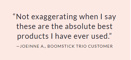
- Social proof: The page features a section of customer reviews and testimonials
- Benefits-focused copy
- Straightforward call-to-action
Landing Pages (Pros and Cons)
Pros
- Offers more value: Landing pages tend to offer more value to the visitor.
- More versatile: Landing pages sell products, promote events, or encourage sign-ups for a newsletter. Squeeze pages, on the other hand, are limited to one goal: to capture the visitor's email address.
- More opportunity for optimization: With a landing page, you have more opportunities to optimize different elements on the page, such as headlines, images, and calls to action. These are all opportunities to maximize your return on investment.
Cons
- Prospects feel more resistance: It’s the nature of the sale itself. You have more work to do to drive a sale than to collect an email address. Therefore you must provide more value on your landing page.
- More distractions: Unlike a squeeze page, a landing page can have many distractions that can take the visitor away from the primary goal. Therefore you must follow landing page best practices.
- Optimization complexity: It can be harder to pinpoint optimization elements. More variables require testing and iteration before you find the right combination.
When to Use Squeeze Pages vs Landing Pages?
Squeeze pages collect leads and email addresses, making them ideal for building an email list.
On the other hand, if your goal is to generate sales, a landing page is the better option.
Here's the thing: both pages are great tools, and each has a specific use case.
The squeeze page is fundamental for the entry point of your funnel. Its job is to let the right people in (your target audience) and keep the riff-raff out.
You want to provide enough incentive for visitors to share their email addresses, so you can nurture the relationship and bring them closer to conversion.
If you give them a core offer upfront, most visitors won't be ready to commit, and you'll lose them forever.
Now, let's talk about the landing page. It's the sharpshooter of the funnel. It should take your visitors from curious onlookers to paying customers.
Up until this point, you captured the attention and interest of your visitors, and they're in the decision-making process. So landing pages are most helpful towards the end of the funnel when prospects are warm.
How To Build Squeeze Pages and Landing Pages?
If you're looking for a top-notch page builder, then I highly recommend GetResponse. They have an abundance of templates available for both squeeze pages and landing pages. Plus, the page load speed is lightning-fast.
Another great thing about GetResponse is their pricing model - you can get started and grow your business with their free plan!
Try GetResponse out for yourself - it's always worked well for me!
Want to learn step-by-step how I built my Niche Site Empire up to a full-time income?
Yes! I Love to Learn
Learn How I Built My Niche Site Empire to a Full-time Income
- How to Pick the Right Keywords at the START, and avoid the losers
- How to Scale and Outsource 90% of the Work, Allowing Your Empire to GROW Without You
- How to Build a Site That Gets REAL TRAFFIC FROM GOOGLE (every. single. day.)
- Subscribe to the Niche Pursuits Newsletter delivered with value 3X per week
My top recommendations


