23 Beautiful Blog Design Examples & 5 Great Design Tips To Keep In Mind

When you buy something through one of the links on our site, we may earn an affiliate commission.
There's no denying it – blog design is important; it can help you to make a great first impression on your visitors. It can also help you to get your message across in an effective and visually appealing way and keep and attract readers coming back for more.
Think about it – when you visit blog posts, the first thing you notice is the design. And if it's not up to scratch, you're likely to click away and look elsewhere. That's why it's important to make sure your blog design is on point.
It's hard to get a sense of good blog designs without seeing it yourself. So we've compiled 23 unique and beautiful blog design examples to give you some inspiration for your site. After you've browsed through them, we'll give you some tips and valuable insights on how to create an effective and visually appealing design for your blog.
Contents
- 23 Beautiful Blog Design Examples
- AirBnb
- Austin Kleon
- Swab The World
- Opus Grows
- Help Scout
- Create & Cultivate
- Wealth Simple Magazine
- Spotify Design
- Toggl
- Frans Hals Museum News
- Zillow Porchlight
- Desk
- Human Interaction Company
- Monster Children
- Hello Monday
- Adobe
- Zendesk Blog
- Overflow
- Cup of Couple
- Make Us Care
- Elemental by Medium
- Julian Shapiro
- Mailchimp Blog
- 5 Essential Elements of a Well-Designed Blog Post Section
- The Bottom Line: Great Blog Page Design Inspiration
23 Beautiful Blog Design Examples
AirBnb
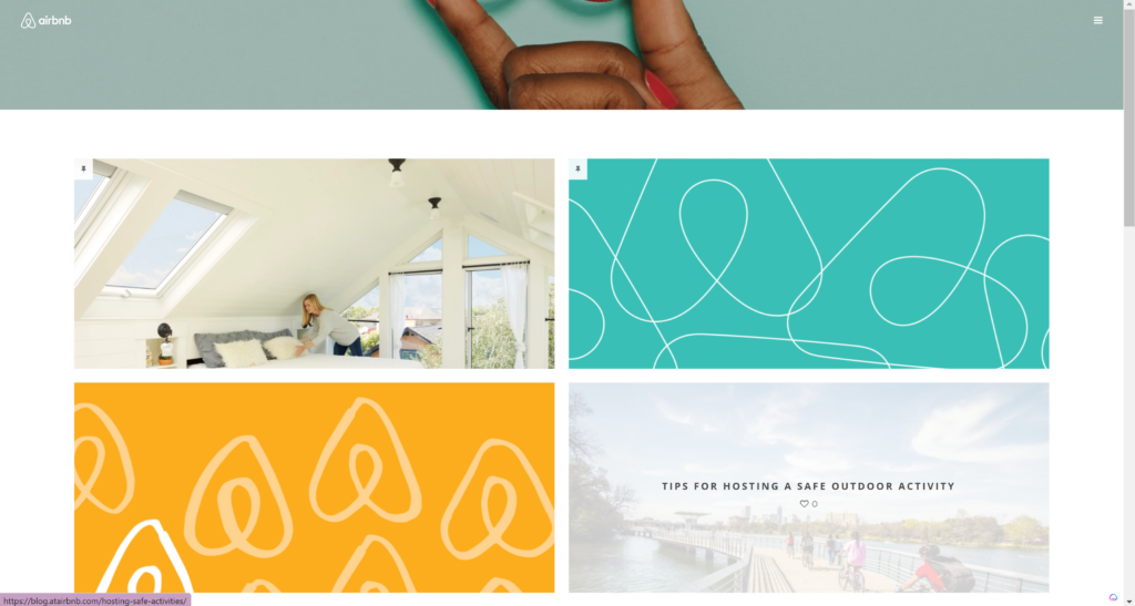
Airbnb, an online platform for the hospitality industry, has a stylish and unique approach to blog design. Their logo is visible throughout the webpage, as the header images, and also as thumbnails of popular blog posts, so it feels on brand all the way as readers scroll. This helps to create brand consistency and familiarity.
It focuses on serving audiences worldwide and therefore has also given the option to read the latest blog post articles in multiple languages. This level of accessibility and diversity is something to consider for your own blog design if you serve a global audience.
The blog uses beautiful soft colors sufficiently embraced by white space. What's more appealing is that once an article is selected, the header shows the percentage of the article read, keeping the readers engaged and encouraged to the end.
Austin Kleon
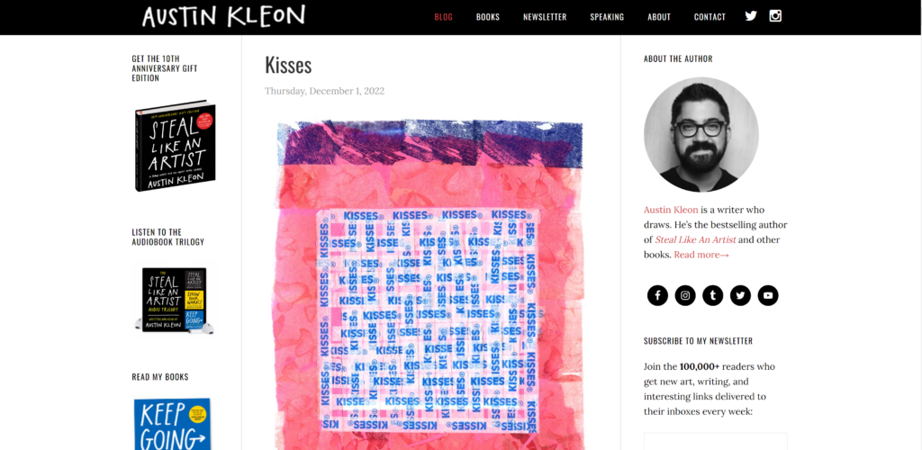
You can expect an author who writes a best-selling book to create a well-designed blog. The use of a monochrome theme, custom images, and real-life examples set this blog apart from others.
Austin Kleon smartly utilizes the sidebars, showcasing its best-selling books on the left and his short bio along with social media icons on the right.
It also provides the necessary call to action to subscribe to the newsletter just to the right. Less clutter and smart segmenting make it easy to read this blog.
Swab The World
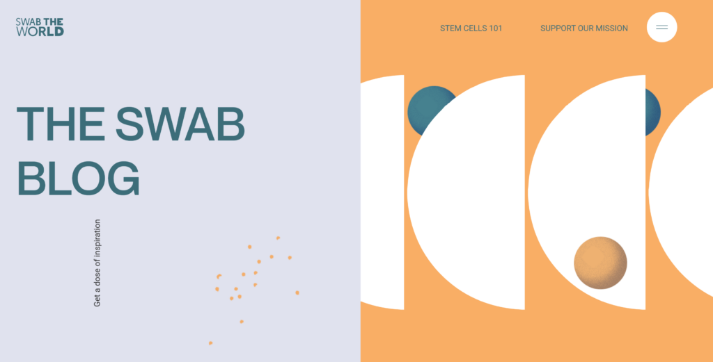
Swab the World is a Non-Profit Organisation that encourages stem cell donation to save leukemia patients. It has a color scheme of teal and blue throughout the blog that matches its logo and helps to establish brand recognition.
One is quick to notice the stunning animation on the homepage that catches the reader's eye. The blog's homepage allows the reader to filter from different categories to reduce the bounce rate.
The blog design successfully incorporates the necessary call to action to 'Become a Donor' by sticking it to the top right of the page even when scrolling down. After all, their main mission is to ask the audience to come forward for this noble cause, and it does so without causing any distraction.
Opus Grows

If you are into gardening or think that organic is the way to go, you might have stumbled across the name Opus Grows. Opus Grows is an organic soil produced as a subsidiary of Rexius.
The company's blog design smartly integrates its parent company in its blog posts without drifting away from providing its readers with essential information.
It has one featured article with a high-quality featured image and a little description above the fold. As you scroll down, you can choose the type of article you're looking for from a category list.
The blog's footer has social sharing buttons along with the call to action for a newsletter subscription. This blog is a great prime example of how a clean design can increase readability and viewership.
Help Scout
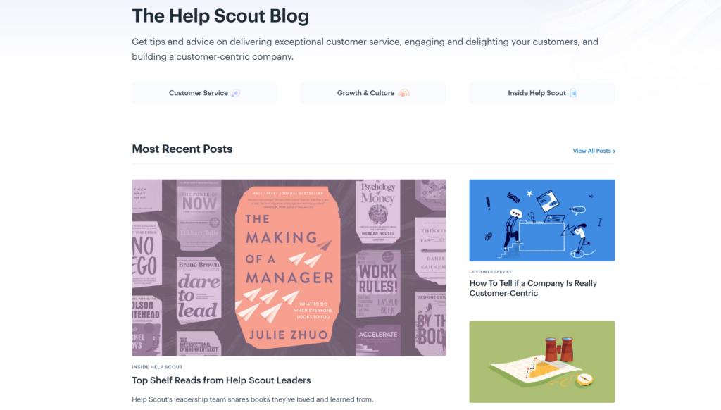
Help Scout is a customer support platform providing businesses with great learning resources through its blog content.
As you scroll through the homepage, you can see how effectively the blog is organized into sections of the latest articles, Editor's Picks, and other categories.
This blog is a good example of how great content, custom images, and minimal design can increase readership.
The blog also invites you to sign up to Help Scout's email list halfway through the scroll, allowing you to customize what information you receive. This is an example of how to utilize your blog design to convert readers into customers.
Create & Cultivate
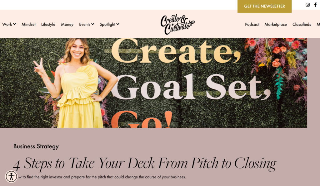
Create and Cultivate is a business blog that provides women with tips and tricks on how to build a career. Its effective use of featured images sends this message across.
Real-life examples are an interesting way to keep readers engaged, and Create and Cultivate does this job the best. It has sprinkled several articles related to women empowerment providing valuable content to its readers in line with the brand's message.
The social sharing buttons appear in the top right corner, along with the call to action to subscribe to the newsletter.
What's unique to this creative blog design is the handy accessibility menu in the bottom left corner of the blog. This can be used to change the screen's color contrast, text size, and text spacing.
Wealth Simple Magazine
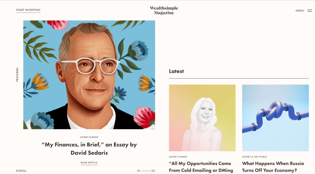
Wealth Simple Magazine uses a stunning blog design to grip its readers. It has very cleanly organized its articles into categories, making it easier to navigate throughout the website.
Even if you present a beautiful blog to the audience, they won't value it unless you provide relevant content in it - this blog successfully achieves that too. The featured and latest articles all speak volumes of how passionate this blog is about guiding its readers to the right investment. And just so they don't have trouble finding it, the business blog gives a clear call to action of investing right in the blog header.
Just head over to this blog to see for yourself what we mean. It can provide you with blog design inspiration for your blog.
Spotify Design
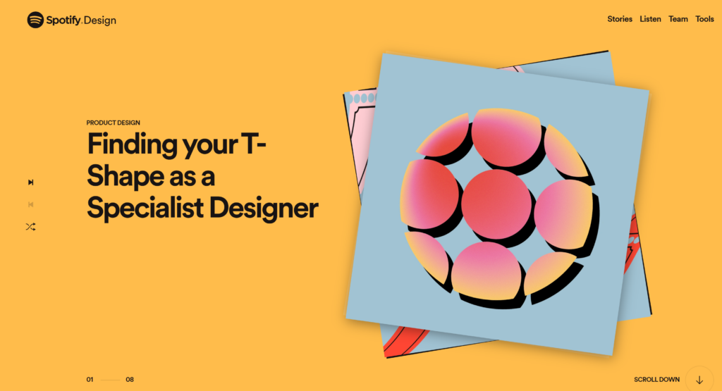
We all know Spotify as a successful digital music streaming service, but did you know that it also runs a successful blog under the name Spotify Design?
As soon as you arrive at the blog, you can see a landing page designed with a beautiful color palette, featured images, and bold font that is consistent with the brand's design elements. This is all before an article's text even appears on the screen.
The section above the fold features eight stories embedded in a striking design, which you can navigate through to choose the article you're most interested in.
When you scroll down, additional articles surface with white space surrounding them, giving the eye a break. When you hoover on any articles or images in this section, dynamic effects appear, keeping the viewer engaged throughout.
Toggl
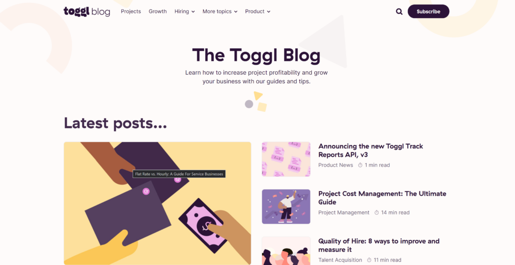
Toggl provides businesses with a set of productivity tools to help them increase their productivity and growth.
Once you land on this blog's landing page, you'll be more than impressed with their blog's design, as it is nothing short of perfect. It brilliantly uses shades of purple that are calming, inviting, and contemporary and also instills a connection to the brand's logo. You'll find variations of this color peppered throughout the blog.
The call to action for subscribing to the blog is right on the menu and in the footer. What's especially helpful about this blog is that it has assigned an article topic tag and estimated reading time to all the articles.
This well-organized system with a search bar, etc. makes it easier for readers to search for content and stay longer on the blog page.
Frans Hals Museum News
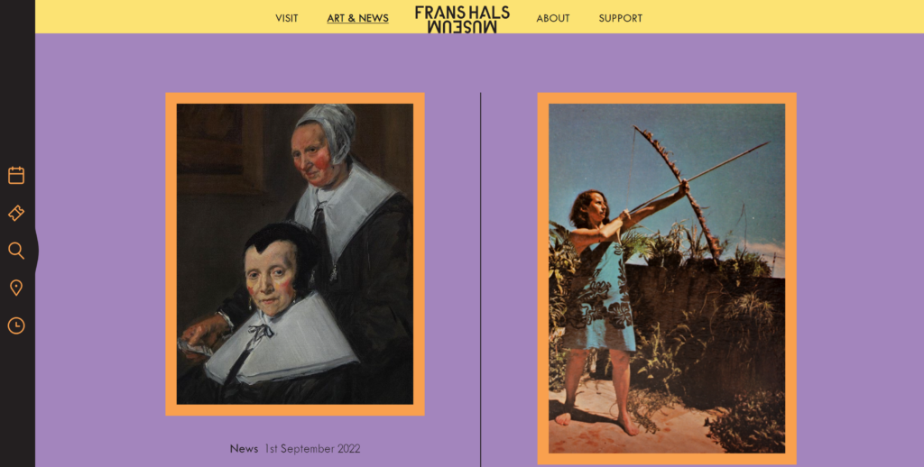
The Frans Hals Museum blog design gives full justice to its dedication to art and history. The aesthetic use of color palettes and paintings all add to the design elements to take you back in time and value the art around you.
The blog has strategically placed the call to action of 'Buying Tickets' in the menu as well as in the left sidebar that sticks around even when scrolling down.
The additional handy icon of the calendar and quick search in the search bar add to the consistent design of the page, where there is beauty in every aspect.
Zillow Porchlight
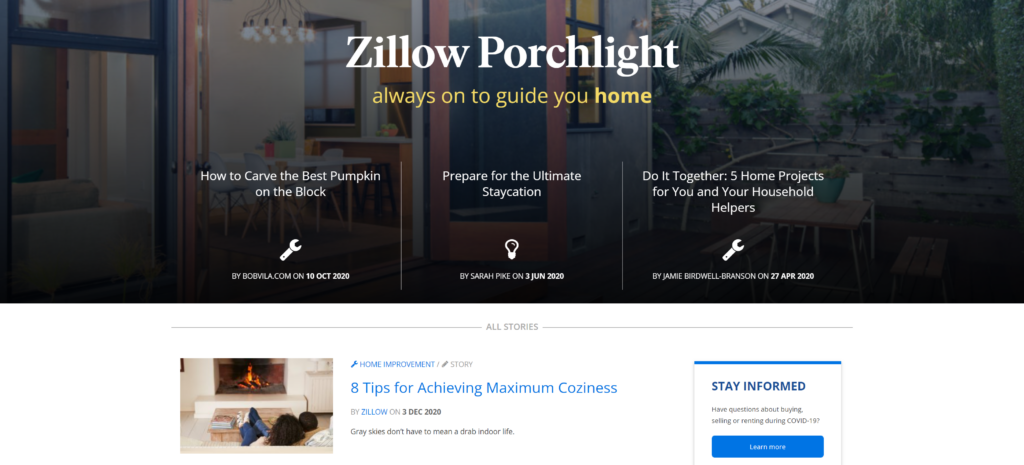
Zillow Porchlight, a real estate website providing home improvement solutions, has what we would call a minimal yet complete blog designs.
The featured image above the fold shows links to 3 different articles that belong to different categories. And to make navigation across the blog page easier for its readers, the categories are also presented in the blog's menu.
The articles themselves have social sharing buttons in the beginning. Overall this blog provides a clean, simple layout without any extra clutter or diversions.
Desk
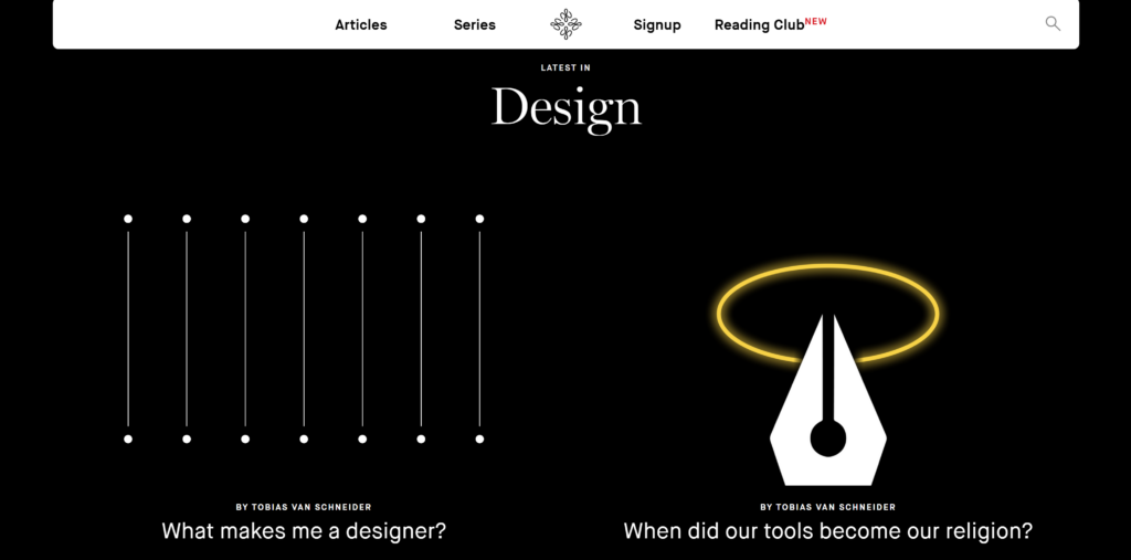
The Desk blog is dedicated to specialist designers, and the images and information available on the blog give credibility to that.
It has a huge stash of information loaded on the blog, but thanks to the well-organized blog designs, it doesn't feel heavy to the reader's eye.
As you scroll down, you can see sections devoted to popular and latest articles, along with a quick search bar present in the header at all times. All these facilities make moving around the blog easier and are essential in encouraging visitors to stay longer.
The blog also uses the contrast of large sections of white and black to create a modern and sophisticated style that breaks up the content rather than overwhelming the user with it.
Human Interaction Company
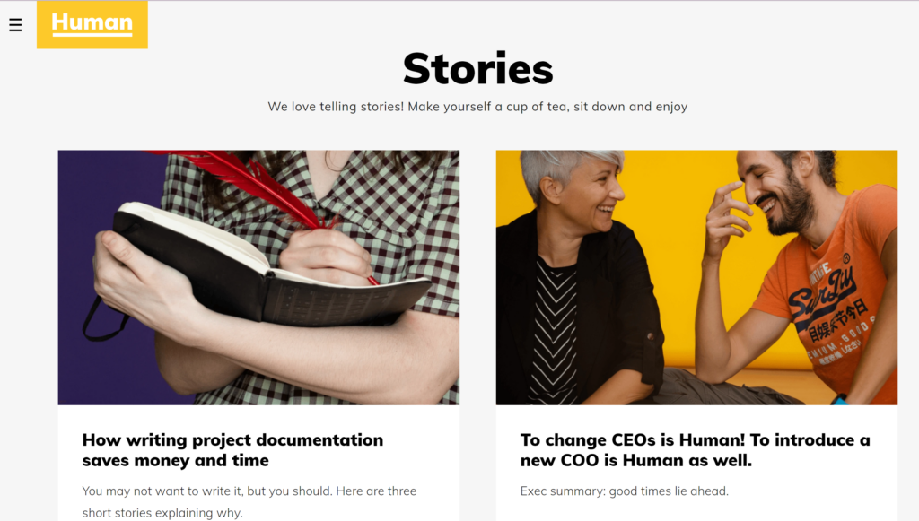
The Human Interaction Company blog is designed with the idea of making the interaction between humans and computers easier. The blog has a white background with an eye-catching color scheme across the blog.
The use of big thumbnails and high-quality images on the site add to the 'big and bold' blog design. The best part though is that it adds to the consistent design of the blog.
Monster Children
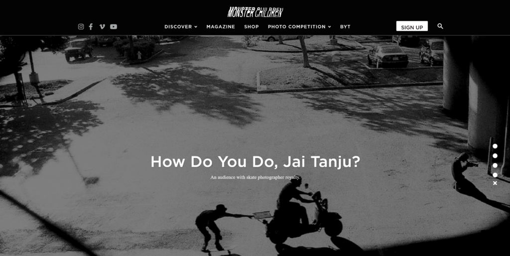
Don't let the name scare you! Monster Children is a lifestyle blog that sets it apart from others, not only with the name but also through attention-grabbing images.
It gives a clear direction to its social media platforms by adding social sharing buttons on the menu along with a sign-up form to the right.
It uses a dark themed design and color palette with a touch of brighter shades to match its brand name and logo. The efficient use of sufficient white space on both sides of the article ensures readability.
Hello Monday
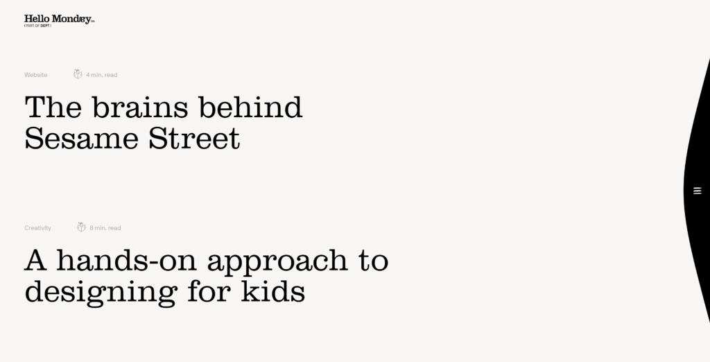
We all dread Mondays, but Hello Monday's mission is to help make it better for companies through its products and digital experiences.
The main blog page grabs attention with big, bold headings along with mentioning the estimated time required to read.
Once a blog post is chosen, it has several relevant images added to the article along with white space that helps create the perfect balance.
Adobe
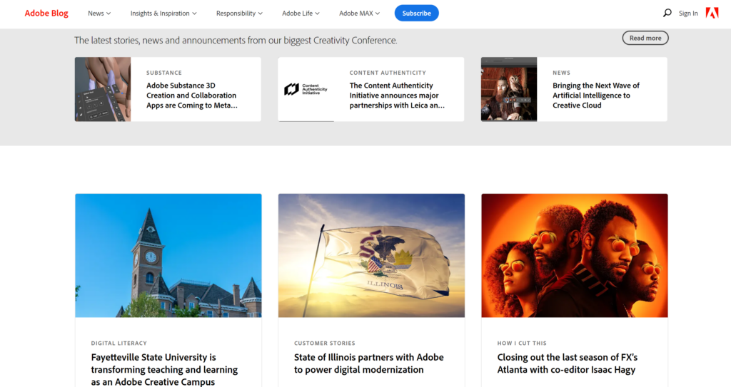
We all must have used at least one of Adobe's products in one way or another. Adobe's blog layout is the perfect example of creating a successful blog by focusing on basic design tips.
It starts with featuring its recent accomplishment as the featured article. As you scroll down, you can scan through several articles presented in a graphic grid design.
Incorporating article tags and categories strengthen the blog's layout and help to keep the readers engaged.
Zendesk Blog
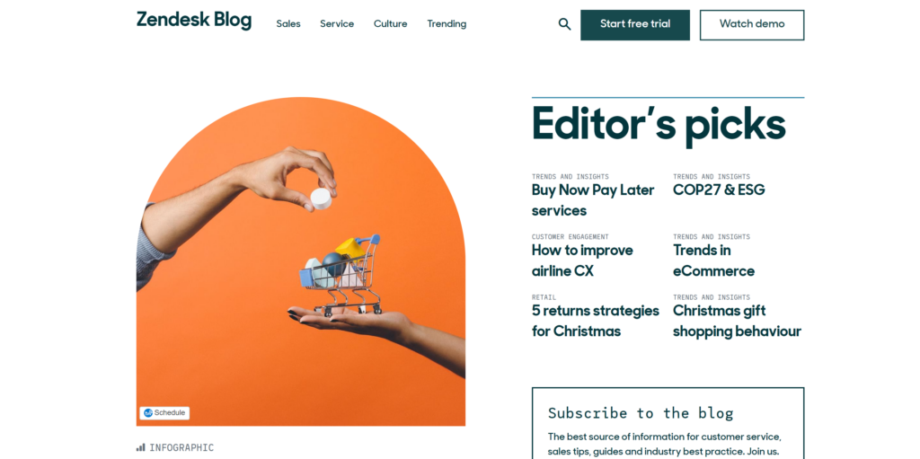
Zendesk has a beautiful blog layout. It has neatly organized its articles into categories on the menu as well as throughout the blog.
The featured article and Editor's Picks grab the reader's attention as soon as you land on the homepage. The varying sizes of font, custom images, and beautiful color scheme all combine to create a delightful user experience that distinguishes this blog from the rest.
Another unique feature of this blog is the learning resource center it has created for its readers. It gives the readers the option to browse through the topic of their choice.
All these elements make Zendesk a reliable source to return to when needing information related to customer service.
Overflow
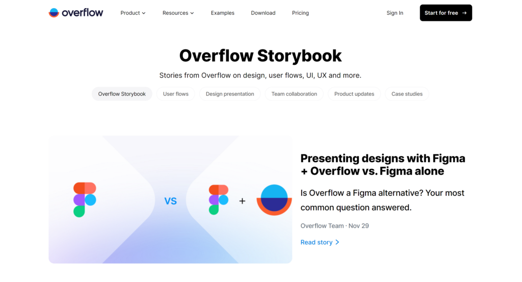
Similar to Adobe, Overflow uses a minimal layout and plenty of white space to improve readability and comprehension.
The remarkable use of color scheme on the blog page matches the hues in its logo, creating brand recognition. To top it, it uses custom images for every article portraying consistency in design all over the website.
The blog also pens down their latest tech news on how it helped various clients achieve their objectives. This is a great way to be recognized as a valuable learning resource.
Cup of Couple
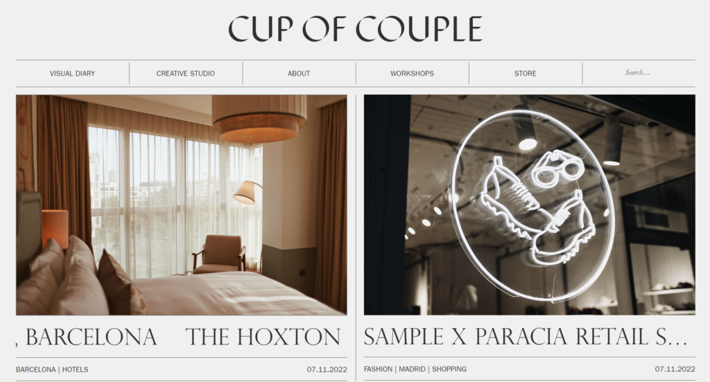
Cup of Couple is a photography blog developed by two photographers who depict their love for still images.
It uses beautiful high-resolution photography to tell its story in its unique style. The blog banner uses featured articles that scroll sideways to give a glimpse of the site.
The blog's footer provides social media icons together with a call to action to subscribe to the newsletter.
Make Us Care
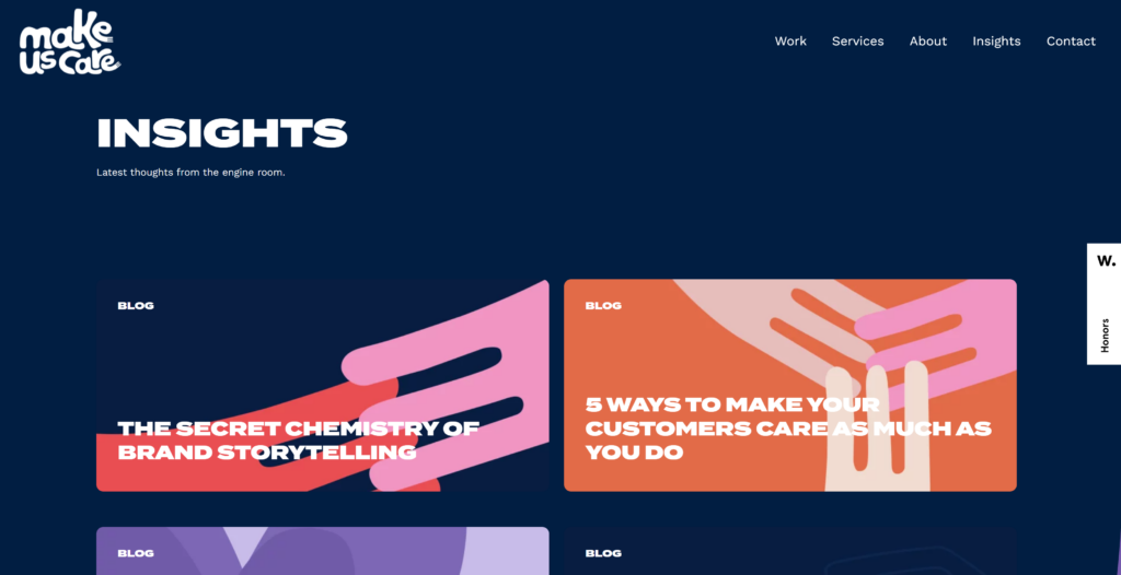
Make Us Care, a marketing agency uses a colorful blog layout consistent with the funky font in its brand logo.
However, these bold colors are not a distraction for the reader, thanks to the plenty of white space provided throughout the articles.
A call to action of 'Let's Talk' to the right of the blog post help turn potential clients into actual clients.
Elemental by Medium
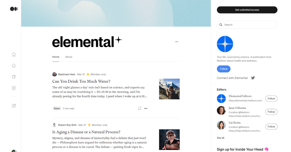
If you are a blog lover, you've heard the name Medium. Elemental is a publication by Medium that is devoted to health and wellness.
It is a perfect example of less is more when it comes to blog designing. The blog has assigned the "estimated time to read" and a category tag to every article.
Once a blog post is clicked, the right sidebar gives a short bio of the author, or an author byline like these examples, along with some other posts from the Elemental collection.
The handy "social media" and "save to collection" icons at the start of the article are placed appropriately for the reader to take advantage of.
Julian Shapiro
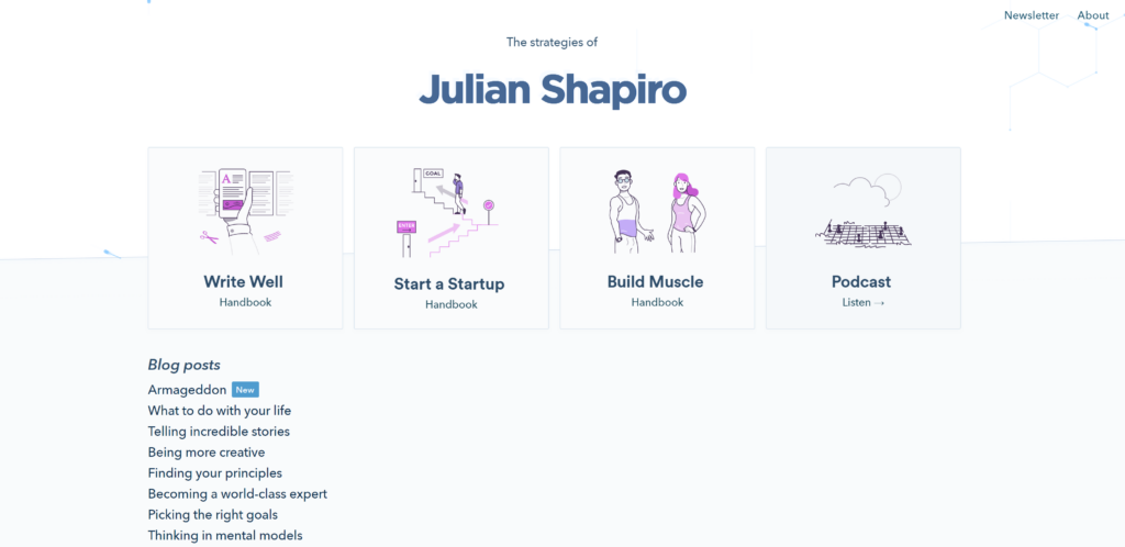
Julian Shapiro is the perfect blog to showcase how great research and learning material triumph over everything.
It uses just a few images as thumbnails for its handbooks, with blog posts listed just under it without any custom design. This minimal approach allows the visitor to get straight to the content without any bells and whistles or distractions.
Another unique feature of this blog is the option to read the article in night and day mode. It is a handy feature, especially when reading the blog via smartphone or in varying light conditions.
Mailchimp Blog
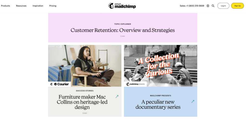
The MailChimp blog is clean and minimal while still maintaining a warm and approachable presence. The use of serif fonts in the header are reminiscent of a traditional piece of mail or news but still offers a contemporary aesthetic.
The use of muted secondary colors is used to create a sense of energy and lightness without detracting from the content. A customized menu is featured after the main articles that help users browse through the best business and marketing practices that could help to improve their email marketing.
5 Essential Elements of a Well-Designed Blog Post Section
Have you ever searched on Google and landed on a page that seemed outdated, boring, and difficult to read? What did you do? Like many others, you must have pressed the back button quickly. After all, it takes only 0.05 seconds for users to form an opinion about a website.
Therefore to make readers stay longer, there are certain design elements to increase user experience.
1. An Organized Blog Layout
A blog layout acts as a structure and guide to your website. Imagine going to your favorite store and not being treated fairly by the salesperson. You may never go to that branch again.
However, with a poor blog layout, you may never consider returning to the blog again.
A blog should be designed to provide readers with easy tools for navigation. It should act as a window to your other posts.
The average user attention span has declined from 12 seconds in 2000 to 8 seconds in recent years. This means that if users can't find what they are looking for in a few seconds, they are more than likely to skip to another blog.
A detailed blog outline comprising necessary article tags or essential categories can help tackle this issue.
Another critical thing to consider is the design of the landing page. It should naturally drive the user's attention to areas containing the most relevant information. Be it a call to action to subscribe, link to their social media, or their most popular blog posts.
2. Clear Readable Fonts
User experience should be top of mind when you're trying to build a successful niche website. Therefore when designing a blog, considerable attention must be given to choosing a font style that is easy to read and understand.
Readers are now more interested in skimming through an article, and fonts like Arial, Roboto, and Open Sans help them achieve this.
Choosing the right font can achieve other objectives too. A large or bold font can stress the importance of key areas of content.
Some other things to keep in mind when designing a blog are to,
- choose font size between 16px to 20px, as this promotes readability
- break content into paragraphs to help skim through content, and;
- leave ample white space to avoid distractions
3. Cohesive Colors
According to research, 38% of people leave a website if they find the blog design unattractive. Color scheme plays a major part in blog layout and brand recognition.
Colors have a significant impact on our emotional and psychological state. Choosing a similar color palette throughout the blog helps to create a unique theme that binds the page together. It also makes users stay on the site longer.
4. High-Quality Graphics
It is easier to understand and remember something when we see a visual representation of it. Graphics make your blog page more appealing and articles with images every 75-100 words have twice the share rate than those with fewer images.
Now, this doesn't mean that any featured image will work. The best blog design examples are those that use content-relevant, high-quality custom images.
Also, over-adding blogs with images can act as a distraction. Hence, it is critical to create a strategic balance when placing graphics of any type.
5. A Smooth Fast Blog
Site speed is a crucial factor, not just for readers but also for Google when it comes to ranking a website.
Every second lost in loading a webpage not only causes an increase in bounce rate but also reduces customer satisfaction by 16%.
To tackle this issue, blog creators should use themes that focus on providing speed and flexibility in designing.
One such theme that brilliantly achieves this is GeneratePress. It is a WordPress theme that loads really fast and is very customizable. The site library has more than 60 designs to choose from and has a 100% PageSpeed Score making it an ideal choice.
If a theme is a layout for your building, plugins are the structure on which it stands. These plugins help to increase the functionality of your blog.
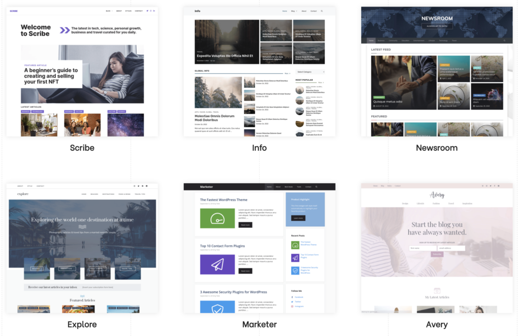
GenerateBlocks, by the creator of GeneratePress, provides extensive features to make your blog work smoothly with a quick loading time.
Using these can help to increase site traffic and increase customer satisfaction.
The Bottom Line: Great Blog Page Design Inspiration
As visual creatures, humans are naturally attracted to aesthetically pleasing designs.
Creating a blog that looks good and is easy to navigate can help to increase website traffic and encourage readers to stay longer on the website.
By using a combination of clear, readable fonts, cohesive colors, high-quality graphics, and smooth, fast blog page design, businesses can create an effective blog page that will be both attractive and memorable.
The best way to get inspired is by looking at successful blog design examples.
So when you're browsing through these examples, ask yourself, what elements of these blogs would capture the attention of my readers? Which ones resonate with the message I am trying to communicate?
By exploring these questions and using the tips provided here, you can create a beautiful blog design that looks great and helps you to convey your message perfectly.
Want to learn step-by-step how I built my Niche Site Empire up to a full-time income?
Yes! I Love to Learn
Learn How I Built My Niche Site Empire to a Full-time Income
- How to Pick the Right Keywords at the START, and avoid the losers
- How to Scale and Outsource 90% of the Work, Allowing Your Empire to GROW Without You
- How to Build a Site That Gets REAL TRAFFIC FROM GOOGLE (every. single. day.)
- Subscribe to the Niche Pursuits Newsletter delivered with value 3X per week
My top recommendations


