11 Best WordPress Themes for Affiliate Marketing (With Examples)

When you buy something through one of the links on our site, we may earn an affiliate commission.
When I started out building my first WordPress websites, I spent more time picking and switching between different WordPress themes than I did generating solid content. I spent hours searching for the best WordPress themes for affiliate marketing.
Looking for the ultimate theme for my empire of niche sites I planned to build. My heart was in the right place but I was wasting a lot of time.
I decided that to get the theme I wanted, I needed to focus on three areas I felt that were most important from my own user experience.
Here are the 3 things I look for in affiliate marketing WordPress themes:
- Do I like the way it looks? Do the blog layouts “feel” good when I’m on the site?
- What do the sites I spend a lot of time on (dwell time) have in common?
- Are the sites fast? If they are slow, I’m probably dropping off quickly.
Contents
- WordPress Theme Review Key:
- 11 of the Best Responsive WordPress Themes For Affiliate Marketing
- WordPress Theme #1: Astra
- WordPress Theme #2: GeneratePress
- WordPress Theme #3: Focus Blog by Thrive Themes
- WordPress Theme #4: Rise by Thrive Themes
- WordPress Theme #5: Performag by Thrive Themes
- WordPress Theme #6: Divi by Elegant Themes
- WordPress Theme #7: Extra by Elegant Themes
- WordPress Theme #8: Magazine Pro by StudioPress/Genesis
- WordPress Theme #9: Eleven40 Pro by StudioPress/Genesis
- WordPress Theme #10: Newspaper by MyThemeShop
- WordPress Theme #11: Your Own Custom Theme
- Customizing Your Theme
- Focusing on how your theme looks: Style & Presentation
- Focusing on the User Experience: Dwell Time
- Focusing on the User Experience: Site Speed
- Taking Action:
WordPress Theme Review Key:
We are going to look at the following for each WordPress theme:
- Theme Overview
- Does the theme encourage time on site
- Site Speed Results: Test speeds at https://tools.pingdom.com
- What I like
- What I don’t
- Live site examples (if available)
11 of the Best Responsive WordPress Themes For Affiliate Marketing
I’m going to cover themes from several different theme architects. When searching for the best WordPress themes for affiliate marketing, I typically find a theme creator that I like and stick with what they do. I’ll test and use a few of their themes because it’s easier to learn the same back end technology from one theme creator than it is to learn 5 separately.
This keeps you tied to a shorter learning curve and gets you working on your website faster. While I haven’t yet mastered all aspects of Thrive Themes and Thrive Architect, Jake (who also works for Spencer) is a Thrive themes pro and can get landing pages up and running in no time.
Me on the other hand – I'm still learning Thrive and enjoying it. When I started out a few years ago, Divi by Elegant Themes was new and I adopted it early on. I’ve used the page builder by Divi pretty extensively, so working through the page builder both in Divi and “Extra” (Elegant Themes Magazine theme) has come second nature to me. And perhaps the best WordPress magazine theme out there!
Find a theme creator that you like and stick with what they offer to keep the time you spend learning the back end of theme-specific WordPress functionality to a minimum.
WordPress Theme #1: Astra
Astra is one of the most popular themes on the market. It's geared with a focus on speed and usability. And it's one of the best WordPress themes for affiliate marketing out there.
This is also the theme that Niche Pursuit's content manager Brady uses on his affiliate websites.
Astra is free, so you don't have to pay anything to use it. There is a premium version, but I don't think it's necessary for most situations.
You won't have to know any code if you want to use Astra. There's no HTML or CSS required, so even the greenest of website builders are good to go.
Astra is also lightning fast (as you'll see in a second) and designed with the user in mind. It's a great tool for serving up a website that looks awesome and moves fast.
Does the Theme Encourage Time on Site:
Yes. Astra makes it easy to send visitors to new posts, add sidebars, and convert visitors to subscribers or buyers. The super fast loading helps ensure visitors won't leave before getting results and won't get frustrated waiting on search engines or another page for you to load.
Site Speed Results:
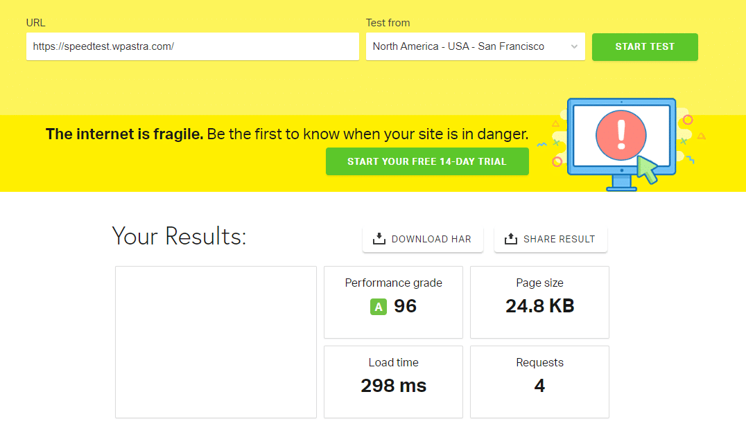
This is wild. Astra is tiny (24.8 KB), but it's not the smallest. The amazing thing is how fast it is. Astra loads in less than 3/10s of a second, which is about how long it takes for you to blink an eye. This is the fastest theme on our list, great for creating the perfect affiliate marketing website.
What I Like About Astra
It's Fast: Astra is the fastest theme on this list by a decent margin (but make sure to check out Astra vs Kadence). It's faster than it's closest competitor GeneratePress and much faster than all the other themes we have listed (don't miss our comparison of GeneratePress vs Astra).
It's Free: Astra has a premium theme version, but many people won't need it. Astra's premium versions are awesome for web design agencies or websites that want to have super strong branding.
If you'd like to create the perfect affiliate marketing website, the premium version has some cool things you can do with your headers and footers. But I would recommend starting free (it's free forever) and seeing how you like it.
It's Flexible: Astra lets you customize a lot and doesn't charge you to do it.
Great With Theme Builders: Astra is the best theme if you're looking to use a theme builder. This could be Elementor, Beaver Builder, or others. But Astra is my top pick for theme builders.
Lots of Add-Ons: The company that makes Astra has a ton of extra features. They can get you several different types of add-ons and plugins for your site to make it better.
What I don’t Like About Astra
They Don't Pay Me If You Sign Up For Free: Pretty self-explanatory. Safe to say I don't make anything if you sign up for free WordPress themes.
Live Website Examples:
Astra has become a big deal in the past few years. Here are some sites that use it:
- LearnDash.com: LearnDash is used to create and sell online courses.
- WPCrafter.com: WPCrafter teaches people how to build and customize their own website.
Click here to use Astra for free
WordPress Theme #2: GeneratePress
GeneratePress is one of the newer themes on the market, but dare I say, it's one of the best. This is the theme that Spencer used on his Niche Site Project 4, and he loves it. You can read Spencer's full GeneratePress review here.
One of the things that are so compelling about GeneratePress is that it's 100% free. There is a paid option, if you want more functionality but you can start with the free option to see if it's the right blogging theme for you.
You don't need any special knowledge to use GeneratePress. No HTML or CSS is required; the theme is pretty much ready for you from the get-go. GeneratePress is designed to get your site up and running in the shortest possible time.
GeneratePress is also a modern SEO WordPress theme and so it places a big emphasis on speed for your website. I'll get into the details in just a second, but this theme is super light and loads fast.
It's flexible, so GeneratePress can work with an image-heavy site or a site with a content focus.
GeneratePress Demo Link: Click here
Does the Theme Encourage Time on Site:
Yes. GeneratePress makes it easy to send visitors to new posts, add sidebars, and convert visitors to subscribers or buyers. The super fast loading helps ensure visitors won't leave your affiliate websites before getting results and won't get frustrated waiting on another page.
Site Speed Results:
So this is pretty crazy.
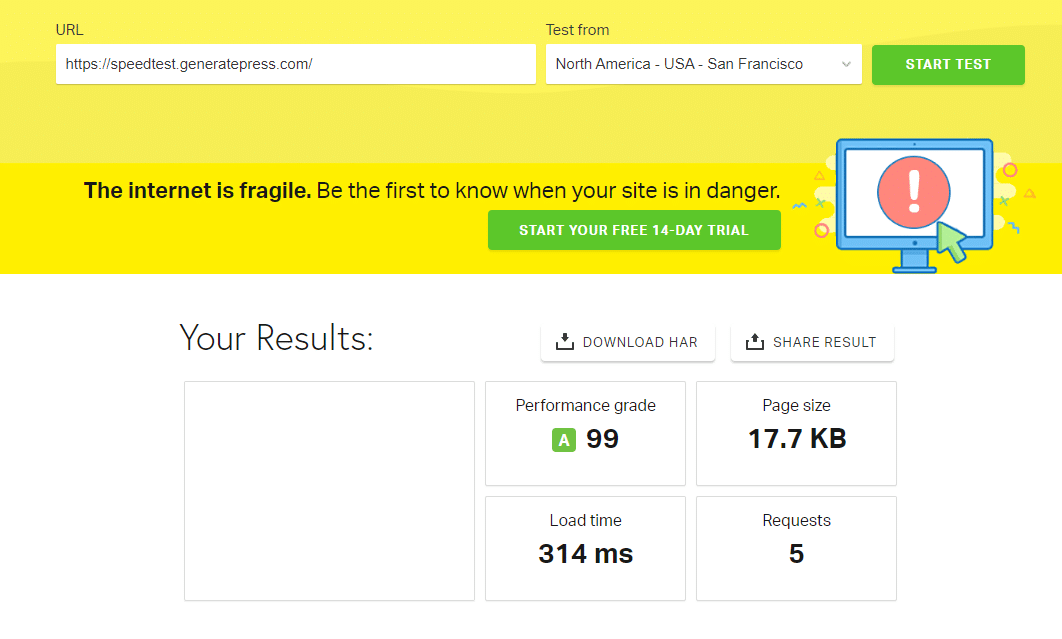
GeneratePress gets a whopping 99 out of 100 on their speed. You cans see that the theme is tiny (17.7 KB) and it loads in a literal fraction of a second. That's crazy to me. It blows the vast majority of the competition out of the water and is free.
One thing that's interesting here is that GeneratePress is smaller than Astra. But it's not faster.
What I Like About GeneratePress
It's Fast: It's one of the fastest themes we look at here. No contest.
It's Free: GeneratePress has a premium version, but you can try the free version to see if it's the right blogging theme for you.
It's Flexible: GeneratePress lets you customize a lot and doesn't charge you.
What I don’t Like About GeneratePress
They Don't Pay Me: I don't get anything if you get the free version 🙂
Might Could Be Faster?: This is pretty nitpicky, but I guess they could reduce their theme by a whopping .02 seconds to be as fast as Astra
In the grand scheme of things, I don't think you're going to lose any visitors over .02 seconds.
Live Website Examples:
GeneratePress is new, but it's already crazy popular. Here are some sites that use it:
- OwnTheYard.com: This is Spencer's Niche Site Project 4. If it's good enough for him, it's good enough for me.
- WPElevation.com: They help consultants and marketers increase their online business
- KimDoyal.com: Kim helps entrepreneurs build authority for their websites
Click here to use GeneratePress for free
WordPress Theme #3: Focus Blog by Thrive Themes
Focus Blog Theme Overview:
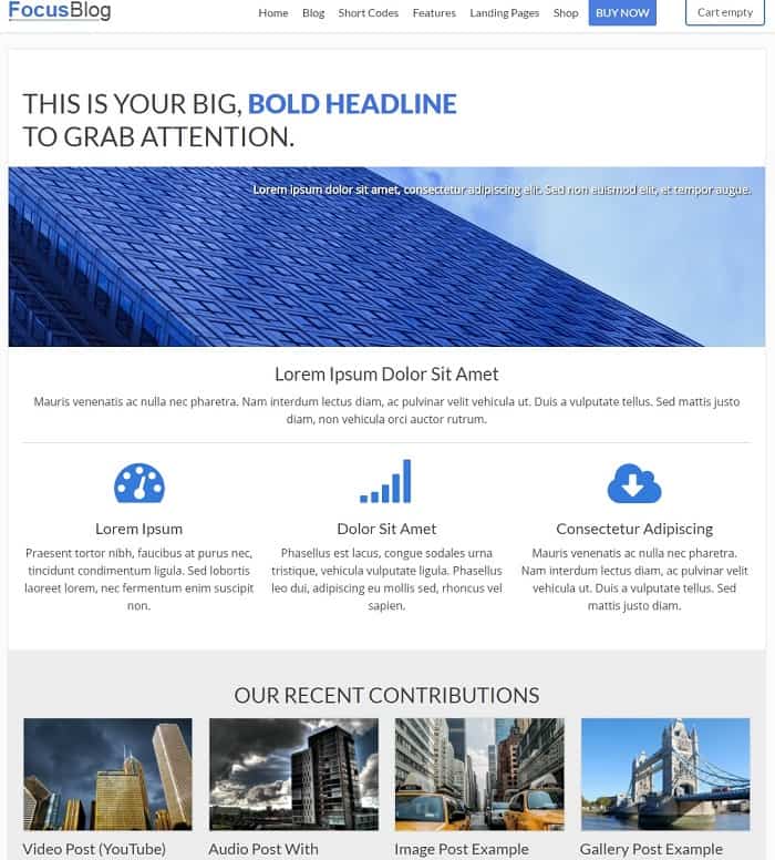
Focus Blog is one of the top themes made by Thrive Themes. This theme is used a number of people that build out niche sites because of the flexibility that the theme offers.
This theme is popular because of the minimalist design and the customization options that the theme allows. Home pages are fully customizable (you can create a page pretty much any way you want with the thrive content builder) and with a little bit of HTML knowledge + custom CSS, you can have a really nice looking and presentable homepage for your authority site.
Focus Blog is awesome for affiliate websites and content rich sites that focus on information delivery ( writing). While the makers of Thrive Themes design with conversions in mind, this Focus Blog stands out as a theme that wants the readers to spend time digesting on the information presented.
While you can setup the theme with sidebar widgets that showcase featured images to improve dwell time, the focus here is truly to get the readers to read the message that you are trying to convey.
If you are creating an image focused site, then Focus Blog can definitely work, but there are other themes that have wider content viewing areas right out of the box. Thrive equips all their themes with an image optimizer as well, saving you a plugin.
Focus Blog Demo Link: Click Here
Does the Theme Encourage Time on Site:
Yes. Because users are focused on your content, it encourages time on site. Focus Blog is a great theme to test out in your niche if you have a lot of information to provide your readers in the form of written content.
You get to put the information you want your readers to look at front and center. With a little customization, this theme can also do really well with display ads.
Site Speed Results:
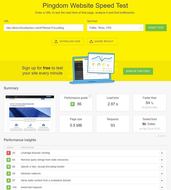
You can see below that Focus Blog performs well with the tools.pingdom.com speed test. It achieves an 86 overall which is extremely good, and it loads at 4.6 seconds for a 5.5MB homepage. This is under my typical goal of 1 second per MB in load time.
The only performance improvement indicator here is to leverage browser caching. If this is your only problem, you are in good shape.
What I Like About Focus Blog by Thrive:
How it looks: The Focus Blog theme looks good. It’s extremely simple, almost like a blank canvas waiting for you to modify it however you see fit. It looks great and is a perfect example of how you don’t need to over think content rich sites that provide great written content.
Simplicity: I like the simplicity. If you are just starting out building sites, thrive themes does have a learning curve, and so you may be interested in some Thrive Themes alternatives. If you intend to use the thrive content builder to build out your site, expect to spend a good 10 hours or so learning the ropes and watching their instructional videos that walk you through all the elements of a properly designed page. Once you master that learning curve, it's simple and quick to make adjustments to using the Content Builder in the Focus Blog theme, or any Thrive theme you decide to use.
Built in Features: The Thrive content builder allows you to focus on the important aspects of the user experience by allowing you to create comparison tables, pro/con lists and more.
What I don’t like about Focus Blog by Thrive:
Learning Curve: If you are a beginner and don’t know basic CSS, you’ll have to rely more heavily on the thrive support forums. Their support teams are solid, but you’ll still be waiting on them for answers if you don’t understand something. If you are a type A personality like I am, that can drive you crazy. Luckily they are usually quick to respond.
Out of the Box Setup: I’m also not a fan of the theme’s overall width. You can customize this with some basic CSS. If you like wider themes, make sure you visit the support forums to find the appropriate coding. It’s not hard to change it, but it’s also not as easy as some of the themes that allow you to do it using the theme’s own customizer.
Live Website Examples:
There are a few well known authority sites using FocusBlog as their WordPress theme. Here are a few of my favorites.
- HerePup.com – Perrin Carrell’s authority site around dogs
- CloudLiving.com – Tung Tran’s authority site around Amazon Affiliate Marketing
- AuthorityHacker.com – The guys at AH use Focus Blog for their own website
You can get the Focus Blog theme by Thrive Themes here at this link.[su_divider]
WordPress Theme #4: Rise by Thrive Themes
Rise Theme Overview:
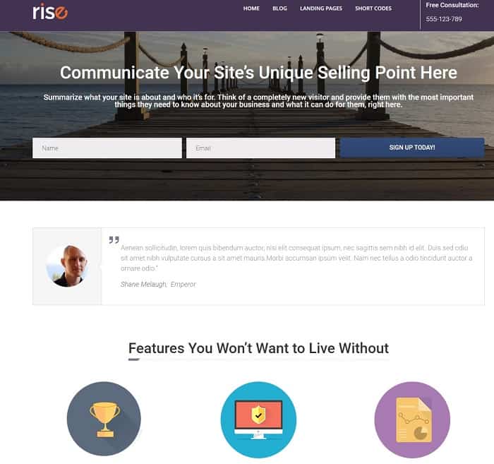
Rise is another great looking theme by Thrive. It has lots of customizable functions, similar to the Focus Blog theme. The homepage allows customization that lends itself well to commercial and small online business use (learn more about how to edit your homepage in WordPress). This is great if you plan to build websites for small businesses on the side while you build out a niche website. It's also a great theme for niche sites.
Rise utilizes the Thrive Content Builder just like all of their themes. Once you get the learning curve down, it allows you to build really nice looking landing pages and blog posts that convert extremely well for your audience.
Does the Theme Encourage Time on Site:
Similar to the Focus Blog theme, Rise is a great theme to keep your customer front and center, focused on your content. While you can definitely modify the look/feel of your content, it’s still primarily a good looking content based theme right out of the box.
Rise is used by some great affiliate marketers on their own blogs, but it can also be used easily by Niche Site builders looking to build out sites to monetize via Amazon or Adsense.
The text and headings both look really good, and with the images on the sidebar, you can count on your customers to stick around once they come to your site and find the information they are looking for.
Site Speed Results:
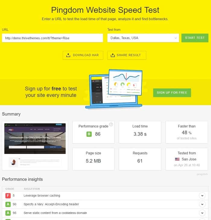
Another winner from Thrive, this theme is coded well and displays good page loading speed when running through our Pingdom test. Like Focus Blog, they keep this theme coded lightly in order to improve performance and speed.
The only recommended changes that the Pingdom test suggests to us is that we need to Leverage Browser Caching which again, like Focus Blog can be fixed by utilizing a Caching plugin like W3 Total Cache.
What I Like About Rise by Thrive Themes:
Opt-In Placement: One of the things I like about Rise is that it allows you to place your opt in on your home page, but also at the top of every post (but find out if it's included in our list of the best opt-in plugins for WordPress). If you are an online business counting on revenue from email marketing, this is a nice feature to start capturing email addresses from your audience without looking too spammy.
Simplicity: Again, rise is extremely simple and allows your readers to focus on your content. There’s not a lot of bloated plugins that the theme is coded with that can slow down your site and slow you down while you figure out how to manage it.
What I don’t like about Rise by Thrive Themes:
Learning Curve: Same example here as Focus Blog – The Thrive Content Builder has a learning curve. If you aren’t familiar with it, you’ll be spending extra time learning how to build it out and how to set it up properly your first time around. If you are a seasoned WordPress veteran, it’s like learning an entirely new piece of software outside of the default WordPress functions.
Content Builder will Hang Around If You Switch Themes: While this isn’t an issue specific to the Rise theme only, if you use the Content Builder to build your pages, you'll end up needing to keep this plugin for the long haul. If you switch themes, those pages don't have a way to revert back to the original WordPress format, so you'll be doing a lot of copying and pasting if you decide to change themes, or you can just keep the plugin so the pages function like they did before.
Live Website Examples:
Here are a few examples of some authoritative sites currently running the Rise Theme by Thrive to power their websites.
- BrandBuilders.io – Brand Builders is a website that sells done for you affiliate websites
- TheHealthyApron.com – Website focused on health, natural remedies and exercise
- Shepped.com – All in one resource for German Shepherd owners
You can get the Rise theme by Thrive Themes here at this link.[su_divider]
WordPress Theme #5: Performag by Thrive Themes
Performag Theme Overview:
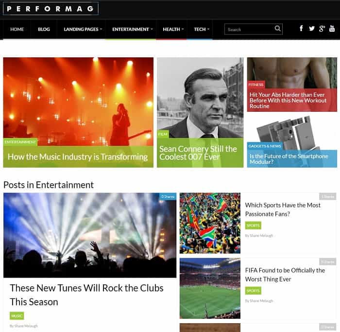
Performag is the theme that the guys at Authority Hacker used on their first major public case study site, HealthAmbition.com. You can see the theme in action here, based on an Archive.org screen capture.
They have since switched over to the Focus Blog theme, also by Thrive and our #1 overall pick for a theme. The site was profitable under the Performag theme, but it’s been changed in no dobut an effort to improve the user experience and speed of the site.
Performag is a solid theme if you are building a magazine style site for your website. If you want a layout that keeps visitors on site with rich images and posts that show images in the widget bar, Performag is a good option the way it comes right outside the box.
Performag Demo Link: Click Here
Does the Theme Encourage Time on Site:
Yes, but I’d be mindful of your audience before picking this theme. The Performag theme is more geared towards websites that are better suited for a Magazine type format. Niches that do particularly well in Magazine style formats are Fashion, Fitness, Home Goods, etc. Think about any industry that has a major publication that’s being read by millions of readers and if you are in that niche, then this is a great theme for you.
If you are building an audience around your own persona, or are focused on content and less on images then this isn’t a theme I’d pick. For image heavy sites, this theme allows the use of Thrive Content Builder and allows you to build out an attractive magazine style site that will retain visitors.
Site Speed Results:
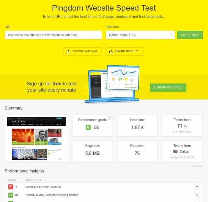
You can see below that Performag also performs well with the tools.pingdom.com speed test. It achieves an 86 overall which is extremely good, and it loads at 1.97 seconds for a 5.8MB homepage. This theme also scores under my typical goal of 1 second per MB in load time.
The same recommendation here applies, to leverage browser caching. Everything else scores very well with the theme.
What I like about the Performag Theme by Thrive:
How it looks: When I first started building sites, I really wanted a clean looking magazine theme for some of my sites. It was tough back then to find a decent looking magazine style theme that performed well right out of the box. Performag does all that and has lots of options to customize as well.
Ad Layouts on Homepage: The 728×90 ad block on the homepage right in the middle as a standard option is a very nice touch. You can use it for display ads or your own banner for a signup or other type of advertisement for your readers.
What I don’t like about the Performag Theme by Thrive:
The Width: Again, I prefer wider content viewing areas. I’m sure this can be changed with some basic CSS, but out of the box, the content viewing area isn’t as big as I’d like.
Theme Learning Curve: Same complaint here that I have with Focus Blog. For beginners this isn’t a problem. But if you are someone that uses WordPress and hasn’t used Thrive before, there’s a learning curve. You’ll have to break yourself of your own bad habits and learn a new back end.
Live Website Examples:
As pointed out earlier, there are a few authority sites using the Performag Theme. Please take a look below to see the theme in action.
- HealthAmbition.com – This is the old design before they moved to the Focus Blog theme
- PirateLifeRadio.com– Personal website of MMA Fighter Tait Fletcher.
- AllTurtles.com– Website about Turtles… I mean who doesn’t love turtles?
You can get the performag theme from Thrive by clicking here.[su_divider]
WordPress Theme #6: Divi by Elegant Themes
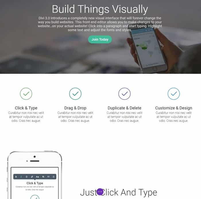
Let me start off by saying that Divi is probably my own personal favorite theme (and is an excellent animated WordPress theme). But it’s not number one on the list because Thrive specifically caters to marketers. Marketers are focused on conversion and getting customers to engage in their content to buy something. Thrive themes and their content builders have a lot of bells and whistles that are specifically centered around conversion that their competitors just don’t have.
With that being said, Divi from Elegant themes is intuitive and extremely easy to use for beginners. I love this theme because you can really do anything with it. You can customize your home pages easily with this theme and best of all – you can choose the content and sidebar widths (or remove the sidebar completely) just by pushing the slider left or right in the customization menu.
I’m assuming the learning curve for Divi’s page builder is about as long as Thrive’s content builder, but I started building sites with Divi when it was first released so I am familiar with it. They do have a newer visual editor that mirrors the functionality of Thrive’s content builder, but I usually just stick to their page builder because I know how to use it easily.
Does the Theme Encourage Time on Site:
Yes because you can pretty much do anything you want with it. You can introduce pictures, customize your posts, basically customize your entire site specifically for what you want your visitors to see. The customization options are pretty much limitless. If you need a wide content viewing area for lots of images, or a one pager that doesn’t have a sidebar – Divi can do it all.
I typically use a plugin to achieve large images in the sidebar of my sites when using Divi. Depending on your niche, images can be a big deal in site retention and dwell time, so being able to customize your sidebar width easily is a nice feature to have when you are trying to boost engagement.
Site Speed Results:
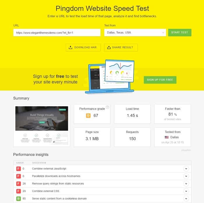
Divi is also a clean theme with minimal add-ons and clean coding. You can see below that the speed test yields a 1.45 second return on a page that’s 3.1MB in total size. This beats my 1 second/MB standard by quite a long shot.
You’ll notice that the coding for Divi has a couple additional recommended performance improvements from a coding perspective than our Thrive Benchmark tests. Some of these will be cleaned up by installing a caching plugin like W3 Total Cache which can minify Javascript and combine external CSS files. With that being said, the coding by Thrive is a little cleaner out of the box and Divi will need to be tweaked a bit to get maximum efficiency.
What I like about Divi by Elegant Themes:
Flexibility: Divi is a fantastic theme if you want a “jack of all trades” theme that you want to learn with. What I mean by this is that Divi can be used to create client websites if you intend to do client work for local businesses, as well as authority websites and landing pages. Divi can literally do it all. Divi is probably an 8/10 for all different types of websites, where Thrive seems to have themes that are built for a specific purpose. They will function better when used for their purpose than Divi will because the themes are more specialized.
Ability to Toggle through the Page Builder & Default WordPress Editor: One thing about thrive is once you use their content builder, you are pretty much stuck with it as the default way to edit that post. With Divi, you can revert back to the default WordPress post format. You will lose your visual changes, but you have the ability to revert which is nice if you prefer to work out of the default editor.
What I don’t like about Divi from ElegantThemes:
You are stuck with Divi once you use it: Once you use the Divi and you use the page builder, you are stuck with it. Because of the way it functions from a coding perspective, if you try and change themes, Divi leaves behind a lot of leftovers. I know the developers are working on a way to correct this, but if you have posts that you’ve spent a lot of time on and worked through the Divi Builder, you’ll need to spend some time cleaning it up.
Initial Learning Curve: Like Thrive, Divi does have an initial learning curve. I personally think it’s shorter than learning to use Thrive, but I’ve also been using the theme for a couple years now so it’s probably a little unfair of me to compare. Divi will take some time to get used to if you use the page builder, which I highly recommend you do in order to create engaging posts.
Live Website Examples:
One thing about Divi – there’s no shortage of people using the theme. It’s being used by over 400,000 live websites today and below are a few good examples.
- TimeLineMissions.com: Photography and Cinemetography company in the Swiss Alps
- DanCarrPhotography.com: Conversion focused professional photographer’s website
- AcademyofMine.com: Teaches you how to sell online courses
- NomadCapitalist.com: Teaches you how to keep more of your money as an Entrepreneur
You can get the Divi theme from Elegant Themes by clicking here.[su_divider]
WordPress Theme #7: Extra by Elegant Themes
Extra Theme Overview:
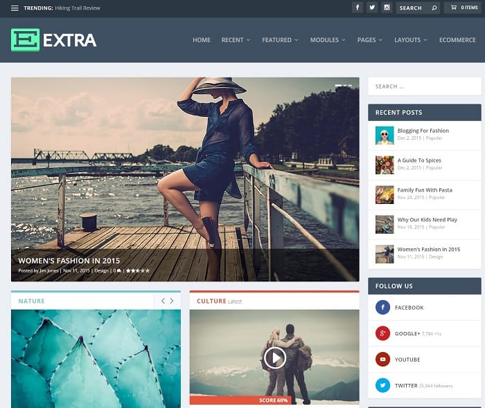
The Extra theme made by Elegant Themes (same makers of Divi) set out to create a magazine theme that still looked and felt like Divi from the back end. They wanted WordPress builders to get the same look and feel when using this theme that they do with Divi, just in a Magazine format/presentation.
Overall, Extra has some really good features built in and also has some features that have driven me crazy when attempting to use it. The Magazine layout lends itself extremely well to the typical magazine style niches that appeal with visual images. Fitness, News and Education can all do well as niches using a Magazine style theme.
Site Speed Results:
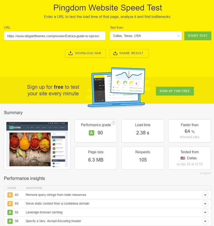
Extra gets good marks just like Divi does when it comes to page speed. In this Pingdom test, the template was able to achieve a 2.38 second load time for a page that has 6.3MB of content. Like Divi, this is below my typical benchmark of 1 second per MB of page loading time and one of the faster benchmarks that we’ve tested so far.
Keep in mind that image optimization is always key. I remember when I first tested Extra on my primary authority site, all my images were full size (2000×2000 image size and larger) and were also in PNG format. These images were like 5MB or more per image. Newspaper themes like Extra will get crushed from a speed perspective because they bring in images into the widgets and footers if you don’t properly optimize your images. I like Kraken.io for any sites not currently using Thrive themes.
What I like about Extra by Elegant Themes:
The Page Builder: Extra’s page builder is familiar to me because I’ve used Divi for so long. It’s a similar layout with the Extra theme. Elegant themes is essentially trying to make these two themes almost interchangeable in functionality. Extra has some limits that Divi doesn’t have, but the Page Builder isn’t one of them.
Customizable Width: Like Divi, width for the Extra theme is literally controlled by a slider. You can make the theme wider or thinner just by moving a bar on a sliding scale. Same thing goes for sidebars. I prefer to have 300 px width sidebars so that opt-in forms are harder to ignore.
Customizable Category Pages: I usually like to customize my own category pages so I can add in an opt-in form or some ad code. Extra lets you customize category pages instead of creating an entirely different page like you’d typically have to do with Divi or any other WordPress theme.
What I don’t like about Extra from ElegantThemes:
Home Page Customization: While you can customize your homepage, you are limited to more of a Magazine format. You can always make a “Page” your homepage and customize that using the Divi builder, but you’ll be lacking some of the features you get when you use Divi.
Thicker Margins around the Text: It’s possible you can adjust this in the theme customization options, but I didn’t put in the time to figure out how to do it. When I was running Extra on my site, I just left it alone and focused on Typography changes instead.
Live Website Examples:
Extra was released in December of 2015. It’s a newer theme and there’s less examples of cleanly running Extra websites to check out, but here are a couple that you can see in live action.
- LoadedLandscapes.com – Website with articles about photography
- The36thavenue.com – Recipies and more DIY tips
You can get the Extra theme via Elegant themes through this link here.[su_divider]
WordPress Theme #8: Magazine Pro by StudioPress/Genesis
Magazine Pro Theme Overview:
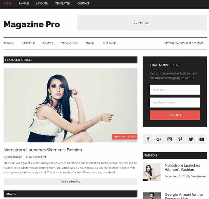
If you’ve followed the Digital Marketer crew for a while, you know that they love to drive traffic from Facebook Ads. They leveraged Facebook Ads to build an extremely strong and vibrant following on SurvivalLife.com. The reason I bring this up is because SurvivalLife.com uses the Magazine Pro theme by Genesis. That’s right, a site that gets massive traffic every single month uses a WordPress template that cost them all in less than 100 bucks.
I’ve tested Magazine Pro before in building out my own site and it has decent functionality but also has some limitations if you are technologically challenged like me.
Overall I have enjoyed using the theme and if you can produce high quality images with a higher contrast ratio, the theme can look really striking. We’ve talked about dwell time earlier in this article and Magazine Pro is a great option for anyone in a “visual niche” that’s looking to increase visitor retention and dwell time on their site.
Magazine Pro Demo Link: Click Here
Site Speed Results:
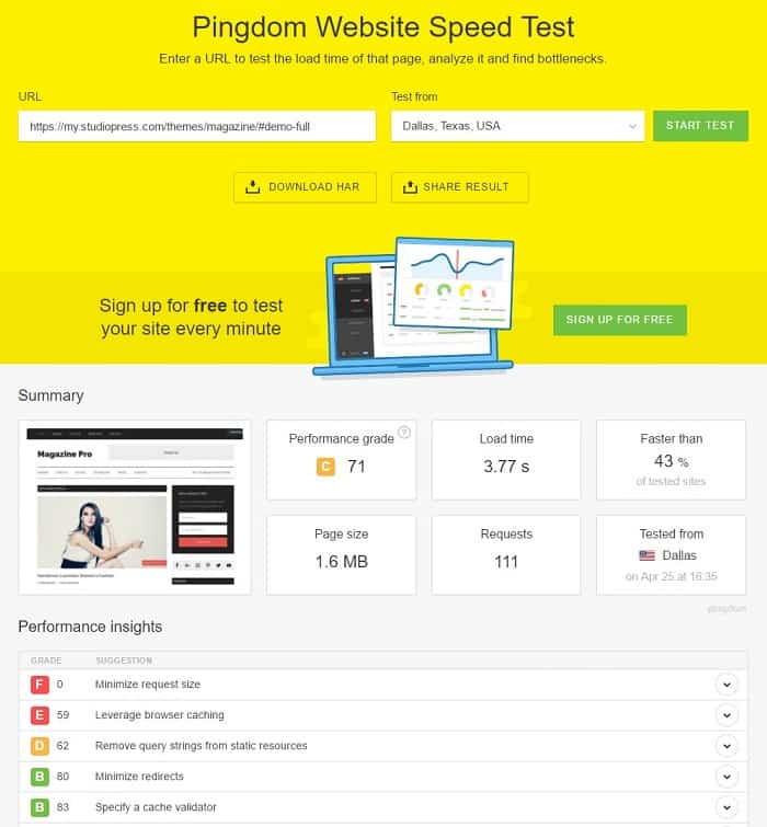
The Magazine Pro is a visually well designed theme, but the theme tests out to be slightly slower than other themes and performance insights from Pingdom.com indicate that you’ll need to leverage browser caching and use minify to streamline the theme. Themes by StudioPress using the Genesis Framework are cleanly coded and optimizing with W3 Total Cache is easy enough to better optimize your site.
If you run the same Pingdom test on SurvivalLife.com (who uses Cloudflare as a CDN) you’ll see that the page loads are around the 1MB per second rule or less once the site is properly optimized.
What I like about Magazine Pro by StudioPress (Genesis):
Look & Feel: I know this is kind of subjective, but I love the look and feel of this theme. It’s simple yet straight to the point. It has a wide sidebar area right out of the box, which I love because it allows you to put your Opt-in right in front of your readers. It also just looks clean for a WordPress Magazine theme.
Ease of Use: While you can customize StudioPress/Genesis framework themes, most of the time you’ll be using exactly what comes outside the box. Customizing the theme can be a little bit more CSS intensive, so if you don’t have basic coding skills, this might be a challenge. As a positive though, the theme is very easy to use and you shouldn’t need to modify it much to get it up and running.
What I don’t like about Magazine Pro by StudioPress (Genesis):
Lack of Beginner Level Customization: If you want to customize the theme, you’ll spend some time learning exactly how to do it. Elegant Themes and Thrive have gone out of their way to provide some beginner level features with their themes to make customization easy. It’s a little bit more time consuming other than basic color changes for StudioPress themes.
Out of the Box Color Choices: I’m being nitpicky here, but you can only choose from a few colors when you install the theme. You’ll need to learn basic CSS and get into the theme editor to change the colors of your hyperlinks and buttons if you have a specific color you want to use to match your site’s logo.
Live Website Examples:
Let’s review some sites using Magazine Pro in live action today.
- SurvivalLife.com – Authority Site in the Survival Niche
- CookieandKate.com – Authority site in the food niche (vegetarian recipes)
You can get the Magazine Pro theme on Genesis Frame work by StudioPress through this link here.[su_divider]
WordPress Theme #9: Eleven40 Pro by StudioPress/Genesis
Eleven40 Pro Theme Overview:
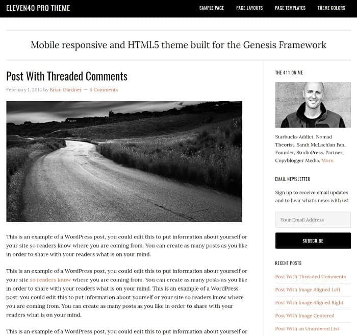
Eleven40 Pro is another StudioPress theme built on the Genesis framework. I have used this theme in the past and so have many people in the internet marketing space. Jon Haver of authoritywebsiteincome.com and Jon Dykstra of fatstacksblog.com both used this theme for their websites when they started producing content. There’s a reason they both used this theme when they first started out.
Eleven40 Pro is a content based theme that’s great for blogging. Jon Dykstra first brought this theme to my attention back in 2015 when I caught on at his site and his process with paying for Facebook traffic and using that process as arbitrage for Adsense revenue. I like the theme mostly because of the large content area viewing width and the minimal header. It’s a quality theme that runs lean and gets the point across. Let’s look at the details.
Eleven40 Pro Demo Link: Click Here
Site Speed Results:
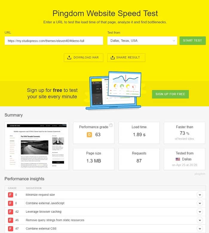
As you can see, the suggested improvements for this particular demo theme suggest that the theme needs some tweaks to run efficiently. I found the same to be correct. By the time I had optimized though, I was around the same site speed produced by some of the Thrive Themes at the unboxing level.
While this may push some people off, keep in mind that the theme is a minimalistic design and some of the performance insights can easily be remedied through minification installation of W3 total cache.
What I like about Eleven40 Pro by StudioPress (Genesis):
Viewing Area: I love how wide the viewing area is for Eleven40 Pro. The viewing area alone makes this a fantastic theme to test out as an option on an existing site or a new site you are creating from scratch. Jon Dykstra also has some pretty solid tutorials of how he setup the site and why he chose it for an image based site (large viewing area).
No-nonsense Design: Whether you are a blogger or a content producer for another niche site, Eleven40 pro brings the content straight to your attention. There’s no frills or fluff, what you see is what you get. This is a fantastic theme for bloggers or even image based sites that need a wider content viewing area. If you know basic CSS coding, it's a great option for any blogger/content producer.
What I don’t like about Eleven40 Pro by StudioPress (Genesis):
Home Page Customization: You are pretty limited with your home page customization options. I looked into making changes myself on an old site I ran with this theme, and the best/most effective option was to essentially hire out a developer to code it for me. I decided against that and eventually moved to a theme that had a customizable home page.
Out of the Box Customization: Again, this is a StudioPress theme. Basic knowledge of CSS adjustments is recommended if you plan to use this theme. StudioPress has a solid support staff, so there’s some good parts to it, but I like a theme that is easy for me to customize with minimal support needed.
Live Website Examples:
Here are a few authority sites that are using the Eleven40 Pro Theme today or in the past:
- FatStacksBlog.com – Prior theme used before Jon Dykstra moved to a custom design
- AuthorityWebsiteIncome.com – Prior theme used before Jon Haver moved to Thrive
- Thoughts-on-java.org – Website all about Hibernate Performance Tuning (java coding)
You can get the Eleven40 Pro Theme from StudioPress by clicking here.[su_divider]
WordPress Theme #10: Newspaper by MyThemeShop
NewsPaper Theme Overview:

The Newspaper Theme by MyThemeShop is a theme that’s based on the look of Lifehack.org. MyThemeShop is well known for taking the look and feel of sites that are doing extremely well and transitioning them so that they are available to the public in WordPress format.
Newspaper Demo Link: Click Here
Site Speed Results:
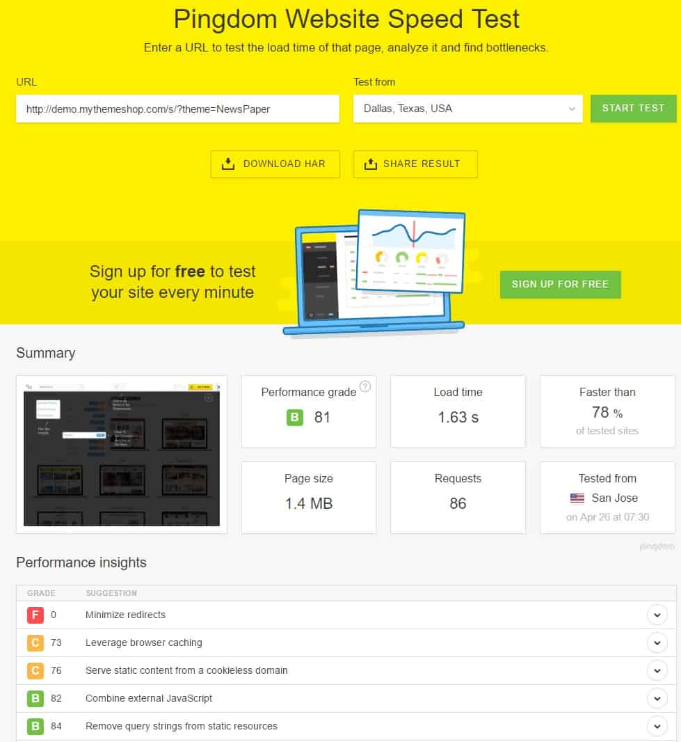
As you can see, Newspaper is well coded. There are minimal recommendations to improve speed and performance on the site and the speed test returns under the 1/MB per Page Load speed I typically aim for.
What I really like about this theme from a speed perspective is that it has a few built in speed options right into the dashboard, including lazyload for your images. This helps immensely if you like to use images in your blog posts/articles. I have used this feature on one of my sites in conjunction with W3 Total Cache and it has helped to improve overall site speed.
What I like about Newspaper by MyThemeShop:
Look and Feel: Newspaper feels and looks extremely modern. I love the way it looks when you hit the site. Right out of the box it feels like there’s plenty of widgets to play around with and there definitely is. The nice thing is that the widgets that enhance the look and feel of the site do not weigh the site down or cause negative impacts.
Home Page Layout: The home page layout has a few different eye catching layouts. The one I prefer the most is the homepage layout as it comes out of the box, but if you like customization, there are options to add a sidebar as well which will give you a little flexibility when it comes to home page monetization. If you want to add your Adsense or Amazon code to the front page as the theme comes, you’ll need to adjust the code of the theme to insert it.
What I don’t like about Newspaper by Mythemeshop:
Default Width: I’m being picky here, but if you use this theme, you are stuck with the default width. So if you want a wider content viewing area, you won’t be able to get it with this theme. You can remove the social sharing built-in buttons on the site (it’s a choice in the theme options) and install your own (I like Sumo for this) which widens the default content area a little bit. Unfortunately, that’s as wide as you go without custom CSS. The home page slider doesn’t cooperate with additional CSS and the images will look funky if you try to widen the theme without hiring a developer.
The Featured Posts under the Primary Menu: It looks nice scrolling across the top, but when you build out your site, you’ll find that these images take up quite a bit of memory and download time. I’d recommend disabling them unless you feel they provide a true value to your site and improve visitor stickiness.
Live Website Examples:
Here are a few authority sites that are using Newspaper theme now:
- Pacedm.com – Marketing magazine for internet marketing
- ConservativeRead.com – News/opinion website with conservative news stories
- TheKindomInsider.com – Inside look into all news that pertains to Disneyland/Disneyworld
You can get the Newspaper theme from MyThemeShop by clicking here.[su_divider]
WordPress Theme #11: Your Own Custom Theme
Your Own Custom Theme Overview:
We are going to use Spencer’s site – NichePursuits.com for this exercise. Building your own custom theme is a great choice, but ONLY if you have the marketing budget to do it. Most people that are just starting out should NOT use this approach. If you are starting your first affiliate marketing blog, stick with a template blogging theme like the ones I’ve shared above and save the money for content/product development.
A custom theme is truly only worth it if you are looking to set yourself apart as a brand like Spencer did a few years back with the redesign of NichePursuits.
Site Speed Results:
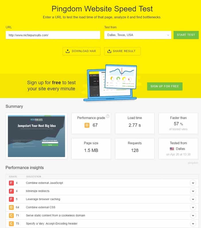
NichePursuits.com comes out slightly behind the other boxed themes that we have looked at this far. The load time for the home page is 2.77 seconds and the page size is 1.5MB.
While looking at a more expensive host may help, when you look at the other Pingdom suggestions, NichePursuits does have some areas where we can improve, even outside of hosting improvements. I know we need to work through some image optimization and installing a CDN which will help with site speed.
What NP has sacrificed in speed, it absolutely makes up for with the conversion increase of having a custom design. Spencer and his developer have increased conversions drastically since the theme was redesigned in 2015.
What I like about having your own Custom Theme:
Control: You have as much control as you want or need depending on how far you want your budget to stretch. Building your own theme will give you full design with your own unique layouts and input on how exactly you want your website to look and feel for your audience when they arrive to view your content.
What I don’t like about building a Custom Theme:
Money $$$$: Expect to drop anywhere from 4k on up for a well-designed custom theme. I recently started shopping around for a custom theme on my own authority site and the costs have ranged anywhere from 4k to 12k depending on what I want to do. Some people will charge you a design per % of revenue earned and charge less up front, which is an option if you don’t want to shell out money out of pocket and already have a profitable site.
Live Website Examples:
There are many great examples of sites with custom WordPress themes, let’s take a look at some of the most popular ones.
- TechCrunch.com – One of the biggest tech websites out there runs on WordPress
- Starwars.com – Yep, even Starwars developers use WordPress
- AMC.com – Walking Dead fans can rest easy knowing AMC is run on WordPress
Customizing Your Theme
When this article was first published, theme builders were weak and buggy. But now, you can customize your own theme without needing to spend several thousand dollars getting a professional website.
In fact, you can customize your theme with your own unique layouts for as little as $40 or so.
There are a few existing WordPress plugins that do this. The two most well known are Elementor and Beaver Builder.
Elementor has the strength here and Brady has done an extensive review on it. In short, you can get your theme to look however you want with their customization options. You can customize headers, footers, post templates, page templates, and more.
Elementor has a free version that allows you to customize posts and pages. The paid version allows you to customize your theme.
Instead of purchasing a theme (no matter how inexpensive), I recommend getting the free version. I like Astra or GeneratePress, but either will work. Use this free version, get the paid version of Elementor, and you can get your site 100% customized.
No designer. No code. No hassle.
[product box id=”1″]Focusing on how your theme looks: Style & Presentation
This has always been the most important thing to me – how does the theme feel when I’m on the site? If the theme feels good and it’s easy to navigate, I tend to stay on the site longer than if it’s complicated or unorganized.
If the site looks like it was created in 2006, I’m probably not viewing that website as a credible information source unless it’s from a government or educational resource (notorious for having older interfaces).
If you don’t like being on your own site, chances are your visitors don’t either – no matter how good your images are. It’s important to like the style and presentation of your website so that your users will as well.
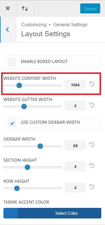
Luckily some of the themes I use allow full customization of your homepage and even your posts. If you like wider themes, you can adjust the width using the theme’s editors or even a little custom CSS. If you prefer to have no sidebar over a right hand sidebar, you can usually customize this at the site level or on a per-post basis.
Improving Style and Presentation:
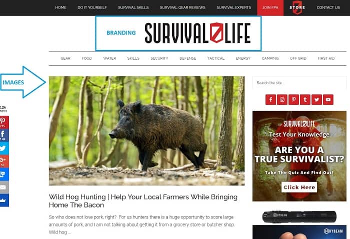
The single biggest thing I’ve done to increase time on site when switching WordPress themes is switching to a theme that allows you to incorporate robust visuals. On affiliate websites I like images on my sidebar next to the content it represents and a home page that has a lot of visually appealing images and/or graphics.
This will help people view your site as a legitimate resource for any information you are trying to provide them. Survivallife.com created by the guys over at Digital Marketer do a good job of using a premium WordPress template library and making it pop with good visuals and branding.
The best thing to think about when considering styles and visuals is “would I stay on my site if I came to it looking for information?” If the answer to that is “no” then you need to make adjustments.
Focusing on the User Experience: Dwell Time
While I know that I was doing the right thing by focusing on the user experience, I was still pretty new to building sites. This led to hours of wasted productivity that I should have been used generating content.
The reason I say that I was doing the “right thing” is because while user experience didn’t matter as much in 2013, it matters a whole lot more today. This is why picking the right theme for your audience is crucial when you are first starting your site.
Time on site or “Dwell Time” is definitely a signal of site quality. As people spend more time on your site, this signals to search engines that your site has good content and is a quality site. It makes complete sense – if your users like your content, they will stay on your site for longer periods of time. That means it’s relevant and should matter as a ranking signal to Google and other search engines.
While dwell time as a statistic is currently a less important factor than your content or backlinks, you should still consider it when building out (or maintaining) your website.
Bottom Line: Pick a WordPress theme that looks nice out of the box or a theme that you can customize.
Improving Dwell Time:
This post from Ahrefs walks through Dwell time statistics and basically says if you aren’t in the top 10 for your targeted keywords, don’t worry about dwell time. I completely agree that it shouldn’t be a primary focus if you have no traffic. Content and Backlinks come first.
BUT….if you can pick the right theme and blog layouts for your site from square one, you won’t need to worry about your user experience once you start driving some traffic to your website. It all matters. You just shouldn’t lose sleep over it.
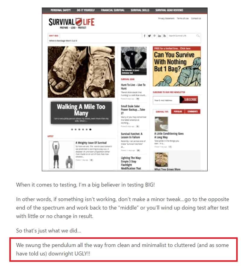
Ryan Deiss at DigitalMarketer.com published this article in 2014 that showcased how simple theme selection improved their average user time on site by switching to a “messier” looking theme. While different themes / blog layouts cater to some audiences better than others, good visuals are a strong indicator of quality. They will keep your visitors on your site for longer periods of time.
This is important if you plan on buying traffic at any point and sending it to your site via Facebook or other advertising methods. You want people sticking around your site as long as you possibly can, especially if you are paying for your visitors.
Bottom Line: It’s easier to pick the right WordPress theme on day 1. It’s even better if you can pick one that allows for a wide range of customization so you can work with your audience and provide them an experience that keeps them on your site longer.
Focusing on the User Experience: Site Speed
Site speed is a big deal. I’ve seen some websites that average 2-3 seconds per 1MB of page load time (or more), which is double or triple where you’d want it to be. Ideally you’ll be at 3 seconds or less to load a page, and 1MB per second of load time is a good target to shoot for.
When sites take a long time to load, that can be a result of picking a WordPress theme that comes with an assortment of bloated plugins, hosting or a combination of both.
While picking the right hosting company can help your site speed (we recommend BlueHost Managed WordPress hosting) – your speeds will suffer if you pick a fat plugin laden WordPress theme for your site.
Bottom Line: Don’t bury yourself with themes that require tons of plugins and gadgets. Look for themes with the features that you want already coded into the theme.
Improving Site Speed:
No matter which theme you are using, you should consider picking up a CDN that integrates well with a caching plugin like W3 Total Cache. Some themes like those offered by MyThemeShop actually have speed optimization built in.
Bottom Line: Hosting Matters, but pick a minimalistic theme that’s coded well.
Picking the Right WordPress Theme:
Let’s take a look at 9 of my favorite WordPress Themes that I enjoy using for my niche sites. I didn’t have this advice back when I started, so hopefully this will help you determine which theme will be best equipped to fit the needs of your website and your audience.
The 9 WordPress themes we are going to look at in detail are themes that I have or do use regularly in my arsenal. Keep in mind that I’ve used at least 200+ themes building out sites over the last few years, and the information below is just my personal experience and personal preference.
**Pro Tip: If you ever want to know what theme someone is running, you can plug the website in at WPThemeDetector and it will tell you if that website is running a template on WordPress or a custom theme.
Taking Action:
It doesn’t matter if you are just starting out in your online journey, or if you’ve been building websites for years. Finding the best WordPress theme for your website is something you should take into consideration as soon as you start planning out your content.
There are literally hundreds of thousands of themes on the market to choose from which can make things awfully confusing.
Any of the choices we’ve talked about are solid – but once you pick your theme, do not sit idly by and take no action. You have to take massive action if you want your website to succeed, and picking the right theme for your visitors to experience is just a small part of that.
Don’t waste time like I did and flip between multiple themes trying to create the perfect affiliate marketing website. Pick one of the free WordPress themes that caught your eye, stick with it, and start blowing your audience away with amazing content.
Want to learn step-by-step how I built my Niche Site Empire up to a full-time income?
Yes! I Love to Learn
Learn How I Built My Niche Site Empire to a Full-time Income
- How to Pick the Right Keywords at the START, and avoid the losers
- How to Scale and Outsource 90% of the Work, Allowing Your Empire to GROW Without You
- How to Build a Site That Gets REAL TRAFFIC FROM GOOGLE (every. single. day.)
- Subscribe to the Niche Pursuits Newsletter delivered with value 3X per week
My top recommendations


71 Comments
Conversation
Interesting read. Kind of amazing almost all the themes I’ve ever used are on this list which is a good sign I guess. You can’t go wrong with Thrive Themes though, I used a lot of the themes from StudioPress for years but I recently switched to Thrive Themes and they are great. Like you said though there is a bit of learning curve but I don’t mind the challenge. Thanks for sharing, it’s always good to see what others are recommending.
Thanks Chris! Totally agree, Thrive is where it’s at right now, at least for me if you want to be conversion focused. I’ve personally used all of these themes and they are all good.
Elegant Themes is also a great option, but Divi and Extra are really the only two themes they make I like to use. Thrive gives me a lot more options for multiple sites.
Hi Chris,
Do you have any experiences with converting an existing site into a site with ThriveThemes and the Thrive Content Builder. If so what is the best way to go forward with this?
Hey Remco – this is Jason (not sure if you meant the comment for me or Chris) but I’ll answer from my perspective.
I don’t have any experience converting from another theme to Thrive, have only used it to build a site from scratch and manage an existing site. I have converted a theme away from Thrive, and I had to keep the Content Builder as a plugin for the site to function correctly.
I just went ahead and tested the Content Builder on a non Thrive theme (this should accomplish what you are asking) and you can convert any post to a Thrive Content Builder post as long as it’s in default WordPress format. You’ll have some playing around to do with the layout, but you can really do whatever you want.
Hope this helps!
Thanks, used a Genesis theme where the TCB did not work well enough , so i had to change themes and decided to switch over to a Thrive theme. But is takes more time than expected to get this one working like the way i want, so maybe there was some advise / guidance
How can you guys recommend Bluehost? I know they have the highest commission percentage, but they are a terrible host compared to WPEngine or WPX….super slow, lots of downtimes and poor customer service.
Any if Bluehost is so good, then why don’t you host NP there?
I outgrew bluehost years ago. Bluehost is a great started place for sharer hosting, when your site grows, its time to move.
Hey Luke, thanks for the comment. As Spencer mentioned, BlueHost is great for someone that’s just starting out.
Take my Mom for example. She’s an author, in her early 70’s and just now starting to build her first niche site (Love you Mom!). I would not recommend she go out and drop 20-30 bucks a month on hosting when she’s still learning how to properly structure a website. A shared option through BH is fine for her first year. I’d rather her put that money back into content, branding or her logo design on a new site.
Once she has some traffic, WPX, WPEngine or other Managed WordPress hosting is definitely a wise investment. For now, she needs to learn the basics.
Hey! Loved the post. Is there any free WordPress themes that you could recommend? As I am on a really low budget..Thank you. 🙂
Hi Sim,
This is a tough question because it depends on what type of site you are building. If it’s a basic blog and you want a theme that is coded very cleanly, something like Casper would be great if you are hosting a personal blog. If you google search for “Casper WordPress Theme” you should be able to find it.
If you are doing an Amazon Affiliate or Adsense site, I’d recommend taking a look at one of the premium themes – they will give you a lot more flexibility in the long run and will be worth the initial investment. MyThemeShop even has a monthly option, where it’s around 9.00 per month for all of their themes.
One feature that I’m missing on Divi is that there is no nofollow tag option for the CTA button module. Hopefully this will be added soon.
Agree Andrej, hopefully this gets fixed soon. Not a deal breaker for me – I usually don’t use the CTA button too often when using Divi, but it would be good to get fixed for sure.
Very informative article for all us newbies just starting out. Thanks!
Furthermore… can you recommend anyone, or service, that offers a ‘done for you’ niche selection with content on a great template?!
I am looking for a turnkey (& ideally aged) website to get out of the ‘newbie’ gate faster!
[ If this service does not exist, maybe an idea for niche pursuits to pursue. 😉 ]
Thanks in advance & keep up the good work!
Hey Brad – this is Jake from Spencer’s team. I’ve actually just started a Fiverr gig that does some of what you’re looking for. I’m not doing niche selection or building the site, but for people who have done that part, I’ll research a list of keywords and the types of content they should create so they can dive right into building content. If you want to check it out: https://www.fiverr.com/jakecain7/custom-keyword-research-and-website-seo-content-strategy
I recently bought the Marketers Delight theme, really happy with it. Managed to delete a bunch of social, popup, and other plugins because it does it all in the theme which obviously helps with speed. You should check it out Jason, I switched from Thesis, and you know how fast that is I guess.
Would be interested to know why you didn’t list Thesis theme in there by the way Jason?
Hey Chris!
I’ve used Thesis in the past, but it’s been a while. I do remember the back end being tougher to master than Divi and/or Thrive. That very well could have changed. I remember picking it up when Pat Flynn recommended it in this article here:
https://www.smartpassiveincome.com/thesis-theme-switch/
It’s possible that they have made some improvements, but I never went back to test after seeing the success I have with had with other themes since that time.
Hope this helps!
Yes, Thesis 2 is a bit easier but it still isn’t really for the beginner who wants to play around with things. You probably need somebody with coding ability to help you if you want to do anything major.
I was about to purchase DIVI dev. version.
For me one of the features that I am attracted to in DIVI was its filtered Portfolio module which can be used as a mini directory of tutorials, lessons, sources, etc.
There is also a great plug-in by diviplugins.com for extending this Portfolio module.
Is there anything similar in any of the Thrive themes mentioned?
Hey Oliver – yes, Thrive allows you to use customizable post grids with the Content Builder. It looks like there’s some information that might be useful for you here:
https://thrivethemes.com/custom-post-grid/
Thanks Jason! I liked it!
Just to confirm:
If I will get FocusBlog theme for $67 for all of my sites will it come with Content Builder and free unlimited theme updates?
1 year tech support doesn’t mean that users will not be able to update this theme, correct?
Hey Oliver – You are most welcome! I believe to get the Content Builder on top of the theme, you need the Membership plan ($228/year). You will want to check directly with Thrive to confirm. I know they offer a quarterly plan as well for only $90/quarter if the yearly plan is too steep.
Honestly, I’m kind of a theme junkie… I carry recurring memberships to Thrive, Elegant Themes and MyThemeShop because I use at least one theme and/or plugins from all three developers. Thrive and Divi give you the most out of the box customization options (especially for beginners), just my 2 cents. I don’t think you can go wrong with either pick.
Thanks for the great recommendations! I have an affiliate site and I’m looking to update the theme to add more price comparison features as well as product comparisons.
I saw REHub theme had some good comparison options to allow for multiple affiliate links on one product.
(http://preview.themeforest.net/item/rehub-directory-multi-vendor-shop-coupon-affiliate-theme/full_screen_preview/7646339?_ga=2.103307016.943223797.1493844874-1956597302.1493409251)
Do you have any thoughts on this theme?
I’m looking for a theme with the same criteria you listed but I need a good way to add multiple affiliate links. Mainly from Amazon, the manufacturer, and Hay Needle.
Any help will be greatly appreciated! Thanks 🙂
Hey Kevin!
When it comes to product comparisons, Thrive excels where most themes fall short. If you look at some of the posts on Perrin’s public authority site (herepup.com), he does some product comparisons and isolates them with boxes and other graphics that the Thrive Content Builder allows you to customize.
With that being said, I don’t have any experience with REHub. Seems to run pretty clean to me when I run a Pingdom test – 2 seconds load time with 1.4MB on the page and only one item to fix which will get handled with a caching plugin. It looks slick and I like the layout.
One thing to think through is support. It looks to me like REHub has just under 6300 sales as I type this. Thrive has over 44,000 customers and Divi by ET has been used to build 400,000 websites. From a support perspective, I’d personally be more comfortable with either of these theme publishers because I know what I get from them support wise.
I have personally struggled with support in the past when purchasing a ThemeForest theme from a smaller developer (delays in response time, poor responses, etc.). Lack of proper support is a deal breaker for me. Maybe reach out to the REHub publisher and ask them how you file support tickets, how they get answered and what their SLAs are? Definitely do your research before you commit so you don’t waste money switching down the road.
Hope this helps!
Thanks Jason,
Loving Elegant DIVI for myself and all of my clients… as a marketer you’ll need to know some tricks of the trade to implement page layout strategies and DIVI is getting better all the time with its flexibility in order to allow you to do so.
Regarding page loads and compression, the plugins that I’m finding atm working best are… WP Fastest Cache, WP Performance Score Booster and Better WordPress Minify.
Thanks for the feedback MIchael! I agree, Divi is a great “jack of all trades.” You can really do some awesome things with the theme that you can’t on some of the others.
I would like to mention Squared by Thrive Themes, it doesn’t get as much love in the IM world as I think it should. Not only is it as fast and as feature rich as the other Thrive themes, but IMO from a design point of view, it allows for more flexible designs and more beautiful site designs. In a site I am building and launching this year, I tried out all the Thrive Themes + Elegant themes, but could only achieve my design vision with Squared. You may also think you are locked into flat designs with everything on one page, but that is completely not the case. I´d show some screenshots, but the site is still a secret 😉
Thanks Alexander – just what I needed, one more Thrive theme to test out 🙂
All kidding aside, this is what I do really like about Thrive – they have so many “hits” out of their membership. You really do get a lot of mileage out of your dollars for what they cost.
Thanks for the comment!
Hello,
Can you make a similar post for free themes?
Hey Armand – good suggestion, I’ll ask my boss what he thinks!
About theme performance, when you try with their demo to test on Pingdom or any speed testing tools. You will see the best speed. But when you install on your own site the speed optimization are not the same. Your site is slow than them especially with themes have a lot of options.
Base my experiences, themes from StudioPress are best with SEO & Performance.
I second that. I like this post because my two themes from Genesis made the list. So far, ElevenPro is one of the best for me. And the Magazine pro is what I am testing on. Regards…
Hey Sophy,
Hosting can definitely play a part with regards to speed. But so can a theme that’s not coded well. I also like StudioPress (which is why I have two themes from them listed here) but my only beef with them is the need for more experience with CSS.
If you’ve been building sites for a while, it may not be hard for you to code your own homepage, but I find that some of the other themes are easier to utilize right out of the box. Just my 2 cents. StudioPress is a fantastic developer though, and their support is really good.
Thanks for the comment!
Great list.
I have been a Divi / Elegant Themes user for several years now. I have enjoyed their themes through the years. The Divi and Extra theme are the ones I have stuck with for a while. As I have begun developing a few new sites, I am using the Extra theme. I have even downloaded a few more layouts for it and found them working well.
My motivational website uses a NewsPaper Layout and it fairs pretty well – http://www.theroadtobetterliving.com. I am still trying out several of their other layouts for Extra on a couple other sites.
What other hosting sites are worthy of a look? I currently use Arvixe.
Thanks,
Chris
Hey Christopher – if you are using Arvixe, I’m going to guess you are probably on a shared hosting plan. I’ve used Arvixe myself and had similar speed results as I did on a shared hosting plan with BH, HostGator and SiteGround.
I can tell you that if you are getting enough traffic, a Managed WordPress hosting solution is a good idea. It usually doesn’t make sense unless your sites are getting some traffic to incur the extra costs – just my opinion.
Some great managed WordPress hosting options are BlueHost’s Managed WordPress option (it’s more expensive at 19.99 per month) and also WPX hosting by Terry Kyle – formerly Traffic Planet.
Someone else earlier in the thread mentioned WPEngine – but my only beef with them is that they don’t offer email as part of a hosting package. This is usually a must have for most affiliate marketers.
Hope this helps!
Nice article. Like me, you seem to be a Thrive + MTS fan. Essentially, you seem to have covered options from only four vendors. Most themes from a vendor are very similar in performance with slight variations in interface design. There are some really great themes out there you should look at in a future article.
Thanks Pradeep! Yep, I stuck to the vendors that I know. But to your point – I’m sure there are other good themes out there, you just have to do your homework as to what kind of support structure they offer and their overall performance.
These are those that I’m most familiar with that I think affiliate marketers can have some success with easily right out of the box.
Thanks for the comment!
I am using divi on all my sites for clients now and I have just been wondering about thrive themes for the affiliate sites but not sure how their payment system works as their seems to be several different platforms and subscriptions
Hey Paul – I’d say Thrive definitely has more bells and whistles for affiliate marketers than Divi does. Doesn’t mean you can’t have success using Divi, but I’ve seen noticeably higher conversion rates out of Thrive.
Regarding payments and subscriptions – if you are referring to how you sign up, I believe Thrive has a quarterly or a yearly plan. If you are referring to how customers would pay for courses or other goods while using a Thrive theme, you’d want to check with Thrive support on that because that’s not something I’ve used or experimented with.
Hope this helps!
Very well done. I spent WAY too much time picking out a theme and could have used this post awhile ago.
If you’re looking for a follow up article idea, I’m assuming almost everyone that follows niche pursuits has a money article like “Best Headphones” or Top 10 survival knifes”.
I would be curious to see how you guys do a “best post” and make it look amazing. The table press plugin works great but isn’t very visually appealing. But yeah just a suggestion. Welcome to the team Jason and you must be cool with such a sweet first name.
Haha – thanks Jason! Appreciate the comments!
Great ideas for post topics as well. I’ll consult with the boss man and see if we can work it in!
I’ll keep it simple. I think this is a tremendous post to keep on file when I will be deciding the best theme to choose. Another “classic” here on Niche Pursuits! Well thought out choice of topic to publish! Haven’t really noticed anyone post one as such, until now! Thank you.
Thanks for the feedback Dan! Very glad you find it useful!
Great collection of themes Jason,
All the themes you mentioned here are wonderful and I’m very familiar with them all. To start with, I’m a very big fan of everything that comes with Thrive. I’ve been using their products for about 2 years now and man, they’re indeed the best. One thing that I love about them is their timely customer support. Very supportive indeed.
Now, I’m using one of their theme “Focus” blog in one of my authority sites and I must tell you I love it a lot (No wonder you made it #1 here) :).
Another theme I love here too which I’m also using is NewsPaper by MyThemeShop. That theme is also something else.
All the other ones are great too.
Thanks for sharing.
Thanks for the feedback Anil! Glad to hear that there are other marketers out there that share the same taste as I do when it comes to themes. Believe me, it took me a while to figure out what I liked.
Thanks for commenting!
Great article Jason, especially for us beginners!! I’ll definitely be going with the Divi theme.
Thanks – glad you liked it, it’s a great theme and it’s pretty easy to get the hang of it for beginners!
Wow. Thank you for this wonderful list. I was looking. Here I found a new theme . Thank you!
Glad to hear it!
Epic article, good job!
I’m thinking of opening my own business of website creator and I was wondering which theme was good. There are so many themes out there it’s ridiculous and since I’m a beginner I want to go for the easier themes.
Once again great article, I’ll save this one for later.
Glad to hear that the article helped you out, please feel free to let us know if you have questions!
Jason, thank you! Tremendous job!
I took a look at Thrive themes and Content Builder which I really liked.
I noticed that FocusBlog theme on the 1st place has much simpler layout and menus comparing with Perfomag, for example.
As I understand, healthambition.com switched to FocusBlog to gain speed, cleaner navigation, etc.
Do you think that this simplicity helps with conversions on all types of websites?
What if website covers a lot of different categories and sub categories?
I’m a bit confused if it would be better to stay away from mega-menus and complex pages in this case.
Hey Chris – Thanks for the comment!
I honestly think it really depends on your niche. If you are in a super visual niche (think interior design, architecture, travel) then a magazine theme might resonate with your readers a bit more because you rely heavily on images.
I think if you are branding yourself personally, or are heavily focused on written content, Focus Blog is perfect because it’s clean, fast and converts. If you are taking more of an authority approach where you expect the experts to come to you (think SurvivalLife.com) then I think a magazine style theme is a better choice because it’s more image based and looks like a professional magazine. Digital Marketer is using a Genesis theme on Survival Life but I’m sure they have someone in house or have paid someone to customize it so it fits their reader base.
Ultimately it’s up to you – but If it were me and I was focused more on images and media in my niche, I would go with a magazine theme. HealthAmbition.com ultimately has all written content and they are trying to attract their readers that way so it makes more sense. I think if you are paying for traffic from facebook and have a visual niche (like Jon Dykstra at fatstacksblog) then a magazine theme makes a lot more sense.
Hope this helps!!
One of the best theme is Aspire Pro (Genesis Powered) I ever seen. My best choice was Focus Blog but now I am using Aspire Pro for my most of blogs. Will you please say something about this theme? But if you ask me, I didn’t see any problem yet with this theme.
And another question to Spencer: Is there any plan to reopen your Niche Website Theme? Thank you.
Hi Ethan, I don’t have much experience with Aspire Pro, but Genesis themes in general are well coded and are usually a solid choice for any type of affiliate marketing website.
I would still recommend Focus Blog due to the fact that the Thrive content builder has quite a bit of additional “out of the box” tools that you can use with a pretty minimal learning curve when it comes to creating good looking pages that also convert well.
Hope this helps!
Thanks for writing an article focusing on affiliate marketers special needs for wordpress themes. Most of my clients use the Genesis themes because of their superior SEO and clean coding with fast load times.
Hi Marsha – yep, my first site I ever built and sold in 2013 was created using Genesis. While I personally prefer stuff by Thrive or Divi by Elegant Themes, I’m definitely a fan of their themes for sure.
Thanks for this excellent theme comparison. I’ve been using both Divi and Thrive over the past year and personally prefer Thrive. Also have a few older sites on other themes, but going forward I’ll be using Thrive Themes for everything as I have a Thrive membership that includes a ton of features for the monthly/annual membership fee.
Thanks Jason – I agree, Divi was my favorite until recently. It’s still a fantastic theme with lots of great features right out of the box!
Very disappointing to see 3 themes by thrive themes, makes me question the reliability of this round up.
Hi Adam,
These comparisons were made over my personal observations from building sites over the last few years. I see nothing wrong with having a good experience with Thrive and articulating that. I feel you get the most bang for your buck with those themes and I’d recommend them to anyone starting out (including my own family).
With that being said, I’ve also given five other “out of the box” options (six if you count your own custom theme) to pick from which should give anyone a good foundation of options for their website.
If you have a theme that you feel strongly about, please feel to include a suggestion in the comments and I’d be happy to give it a run to see if it’s something we would recommend to our readers.
Thanks for reading!
Hi,
Very informative article for newbies as like me. I Love Nichepursuits all updates. Thanks for sharing this Article.
Recently i used Focus Blog by Thrive Themes, I am very impressed with it. But I am confused about Plugins, Which Plugins are mandatory for a niche site ? I recently check my Site Speed by Pingdom – looks bad as my expectations. Divi is also a good theme, i used before.
I will build a personal blog where have 7-8 categories, I will upload lots of high quality pictures, this site basically represents Interior work services, Photography services, Printing work etc. But confused which theme is lightweight and which one i will pick for this types of multi services ??
Thankyou. Best of luck always.
Hi Cynthia – keep in mind your site speed may not be the fault of the theme. It could be your host or your image sizes if you aren’t sizing them properly before you upload them.
I think Focus Blog works for just about any type of business or niche – you just need to make sure that other areas of your site are optimized in the same fashion. I wouldn’t get too hung up on plugins, but the biggest one I’d recommend for speed would be W3 Total Cache. You’ll also want to make sure that the settings are setup correctly to yield proper speed results.
Hope this helps!
Hi
It is Long described article for anyone who likes to open his own blog site, he can find here the short choice of themes which one help to him, for me I personally like Focus Blog & Newspaper and those two I use without any disturbance! Anyway thanks for this Article!
Hi Jason,
Great post!
I was wondering if you could please help me decide between Divi and Thrive. My main concern is cost. The Elegant subscription (where you get Divi) is $89 for the annual membership whilst Thrive will set you back $228 for the annual membership. I am leaning towards Divi purely for cost reasons as I am just starting out. Is Divi that bad for conversion on niche affiliate sites or can you optimize a Divi site to match the conversion stats that Thrive can potentially provide? Also, do you guys know any successful niche sites built from Divi?
Any feedback would be appreciated
Hello, Jason. Thanks for your helpful advice. For the time being, I am using a couple of themes for my sites. My best favorites are Focus Blog along with plugin Thrive Visual Editor. It’s quite a great match to make a great website.
Thank you for such an amazing article. I was stuck between choosing one theme for my next website, but I find helpful advice on your article. I must add that I am new to WordPress. Your guide is quite easy and simple to understand for me as a beginner.
Hi Jason,
I am a newbie blogger and I don’t understand much about wordpress themes. As your advice, I used thrive theme (Focus Blog) for my website. I think Thrive Content Builder is the best plugin for building blog’s content.
Your article is very useful for me. A lots of thanks for sharing these helpful things.
Regards,
Sarah Moore.
I already using Focus blog of thrive. Is there any free alternative of it?
i want to buy best premium theme for my site
Hi, thanks for your article, it was very informative. I’ve used Rise before and totally agree with you about this theme. I found Norebro and now I’m using it. I liked that it’s so multitasking, that it can be used to create all kinds of websites, ranging from online-stores to blogging pages. Have u ever tried it?